Importing fonts may take a few minutes, depending on the number of fonts and the speed of the system.
Continue? [y/n] 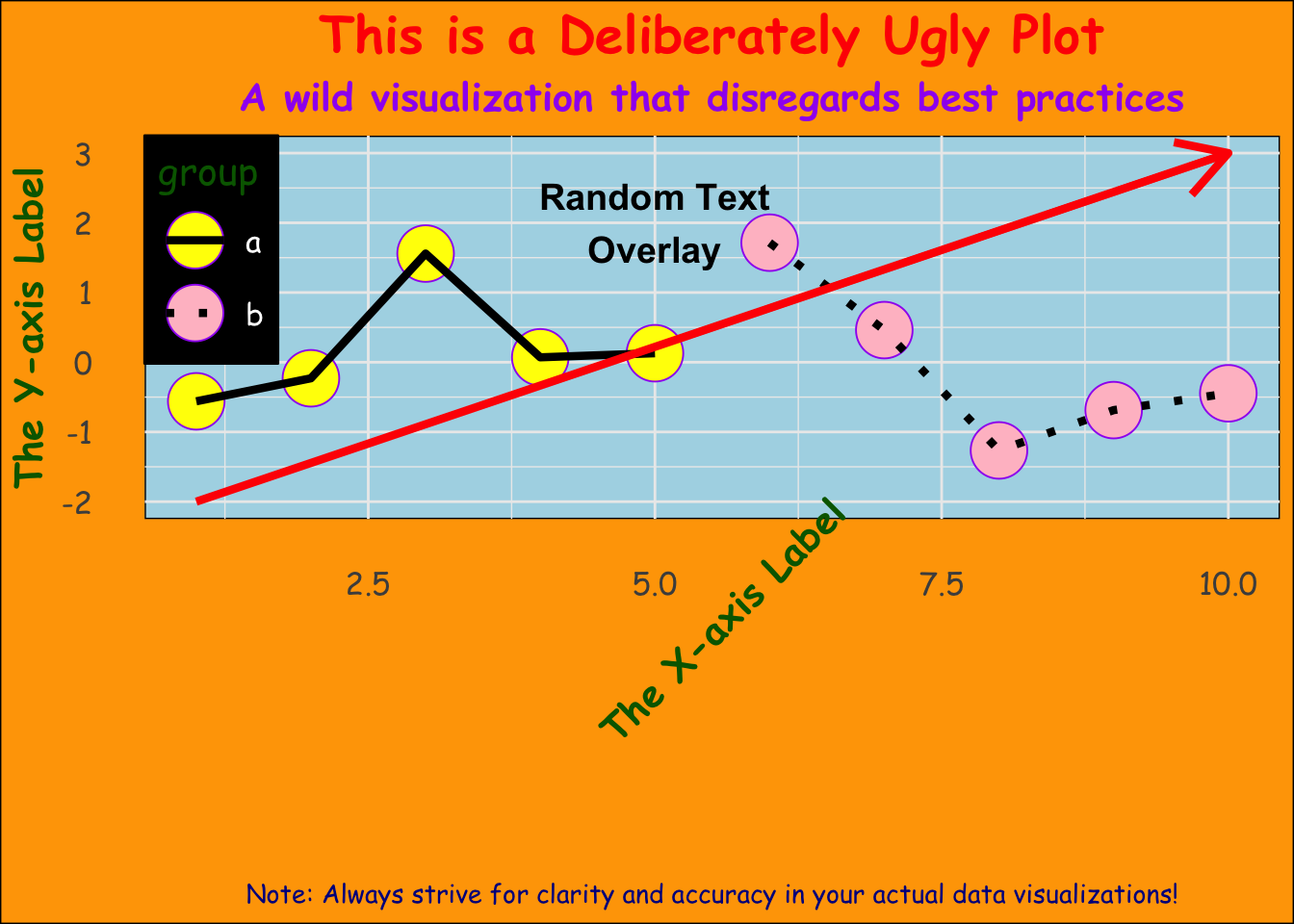
GGPLOT contestCan you harness the grammar of graphics for evil?!
Welcome to the second annual Ugly ggplot contest! This is your chance to show off your creativity and push the boundaries of data visualization by crafting the ugliest ggplot plot you can imagine.
I challenge each of you to create an intentionally ugly plot using the ggplot2 package in R. The goal is to create a visualization that is both aesthetically displeasing and difficult to interpret, while still adhering to the basic rules of plot creation (e.g., including axes, labels, and legends).
Must use a dataset from assignment 1-4 and contain any combination of columns with X and Y coordinates.
Can be any kind of plot (Can you make something that is NOT a bar, box, or scatter plot?).
The plot must have visible axes and a plotted area. All necessary plot parts (axes, axes labels, titles, legend if necessary) must be present and completely legible - no cut-off words or excessively overlapping labels or shapes.
Must be created entirely using ggplot in R.
The plot must be exported as a JPEG file and jpeg and R code (with proper heading, read.csv to the data you imported, ggplot/other libraries loaded, and all ggplot commands to replicate the plot and save as jpeg) emailed to me (lauren.olinger@uvi.edu) by 10 am October 23.
We will choose the ugliest plots based on their innovative misuse of color schemes, creative but inappropriate use of geometries and annotations, imaginative application of fonts and text placements, and overall ability to concoct a visualization that is both confusing and aesthetically jarring while still maintaining basic plot integrity (i.e., including all necessary plot parts like axes, labels, and legends). The plots will be judged on their ability to adhere to the guidelines while pushing the boundaries of unconventional and “ugly” data visualization. Special attention will be given to plots that creatively blend multiple tips for crafting an ugly plot, as outlined above.
All entries that follow the rules above (limit one per student) will receive one extra credit point for MES 503. The winning entry will receive an ugly plaque and bragging rights, forever immortalizing their prowess in crafting a truly heinous data visualization.
May your plots be horrendous, your creativity boundless, and your data forever be clean and accurate in your future endeavors.
Fonts:
Font Face:
Mix different font faces (italic, bold, regular) within text elements.
Use inconsistent font sizes.
Text Placement:
Overlay text on important plot elements, making it hard to discern underlying data.
Place axis labels, titles, or annotations in unconventional locations.
Color Choices:
Use clashing or poorly contrasting color schemes.
Employ patterns or gradients that make the data difficult to interpret.
Background:
Modify the background color to clash with the data colors.
Use an image or a pattern as a plot background that distracts from the data.
Data Point Customization:
Use icons, emojis, or images as data points.
Implement various shapes and sizes for data points within a single plot.
Combining Plot Types:
Axes and Scales:
Legend and Labels:
Annotations:
Theme:
Aspect Ratio and Dimensions:
Transparency:
Find online ggplot packages and libraries to help you:
Importing fonts may take a few minutes, depending on the number of fonts and the speed of the system.
Continue? [y/n]