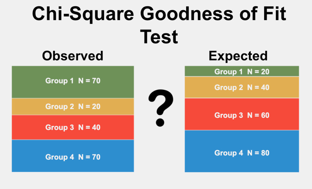
The goodness-of-fit test examines how well observed data matches theoretical expectations. This test works with a single nominal variable and becomes particularly powerful with large sample sizes. The null hypothesis (\(H_0\)) states thatthenumber of observations in each category equals what a theoretical model predicts.
This analysis has further divisions of hypothesis type:
Extrinsic: Expected proportions are known before the experiment (like testing for a 1:1 sex ratio)
Intrinsic: Expected proportions come from the data itself (like Hardy-Weinberg equilibrium tests)
Applying the Test
When running a goodness-of-fit test, we organize our data into categories and compare observed frequencies against expected counts from our theoretical model. The test’s degrees of freedom depend on our hypothesis type. For extrinsic hypotheses (the more common case), we use the number of categories minus one. With intrinsic hypotheses, we subtract one for each estimated parameter and one more.
A low p-value suggests our data significantly deviates from theoretical expectations, leading us to reject the null hypothesis. For analyses involving multiple categories, post-hoc tests with Bonferroni corrections help identify specific deviations.
Real-World Examples
Let’s examine two practical applications:
Example 1: Crossbill Bill Direction
European crossbills (Loxia curvirostra) have the tip of the upper bill either right or left of the lower bill, which helps them extract seeds from pine cones. Some have hypothesized that frequency-dependent selection would keep the number of right and left-billed birds at a 1:1 ratio (an extrinsic hypothesis). Groth (1992) observed 1752 right-billed and 1895 left-billed crossbills to test this prediction:
Calculate the expected frequency of right-billed birds by multiplying the total sample size (3647) by the expected proportion (0.5) to yield 1823.5. Do the same for left-billed birds. The number of degrees of freedom when an for an extrinsic hypothesis is the number of classes minus one. In this case, there are two classes (right and left), so there is one degree of freedom.
observed=c(1752, 1895)# observed frequenciesexpected=c(0.5, 0.5)# expected proportionschisq.test(x =observed, p =expected)
    Chi-squared test for given probabilities

data:  observed
X-squared = 5.6071, df = 1, p-value = 0.01789
The result is chi-square=5.61, 1 d.f., P=0.018, indicating that you can reject the null hypothesis; there are significantly more left-billed crossbills than right-billed.
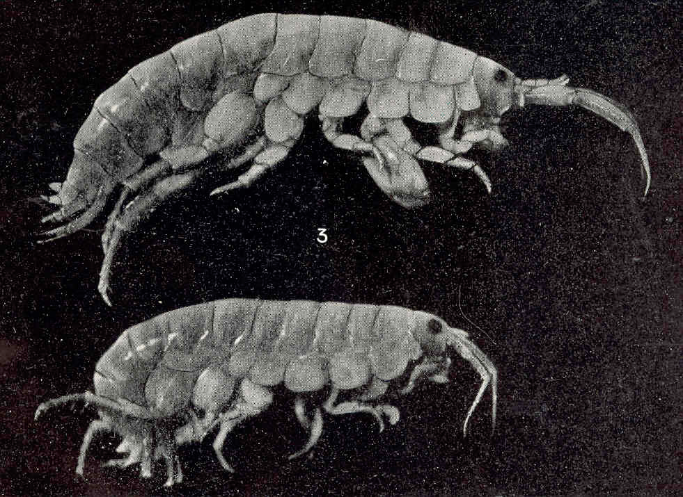
Example 2: Testing Hardy-Weinberg Equilibrium
Let’s explore how chi-square testing works with genetic data. McDonald (1989)’s study of the Mpi locus provides an excellent example of an intrinsic hypothesis test. The research examined genetic variation in amphipod Platorchestia platensis from Long Island, focusing on two alleles: Mpi90 and Mpi100.
The data revealed three genotype combinations:
Mpi90/90 = 1203 individuals
Mpi90/100 = 2919 individuals
Mpi100/100 = 1678 individuals
From this data, we can calculate that the Mpi90 allele appears with frequency 0.459 (5325/11600). Using Hardy-Weinberg equations, this leads to expected genotype proportions of 0.211, 0.497, and 0.293 for the respective genotypes. Since we estimated one parameter (the Mpi90 allele frequency) from the data itself, and we have three categories, our test uses one degree of freedom.
The chi-square value of 1.08 with p=0.299 tells us something interesting: we can’t reject the null hypothesis. The population appears to follow Hardy-Weinberg proportions, suggesting no strong evolutionary forces are disrupting expected genotype frequencies.
Creating Effective Visualizations
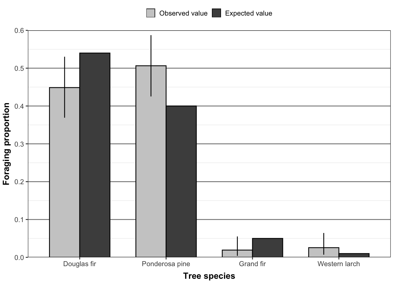
While statistical tests provide numerical evidence, visualizations help us understand and communicate our findings. Let’s create a detailed visualization comparing observed and expected frequencies using tree species data:
This visualization compares observed and expected proportions across tree species. The light gray bars show observed values, while darker bars represent expected frequencies. Black error bars indicate 95% confidence intervals for the observed proportions. When these intervals overlap with expected values, any differences between observed and expected frequencies might be due to chance rather than a real effect.
The plot reveals several key patterns:
Douglas fir and Ponderosa pine dominate the sample
Most species show observed proportions close to expected values
Confidence intervals help identify potentially meaningful differences
Groth, Jeffrey. 1992. “Further Information on the Genetics of Bill Crossing in Crossbills.”The Auk 109 (2): 383–85. https://doi.org/10.2307/4088210.
McDonald, John H. 1989. “Selection Component Analysis of the Mpi Locus in the Amphipod Platorchestia Platensis.”Heredity 62 (2): 243–49. https://doi.org/10.1038/hdy.1989.34.