Data visualization is an essential component of statistical analysis, enabling researchers to quickly grasp complex information, identify patterns, and communicate findings effectively. This section explores key types of plots and their applications in various research contexts.
Key Elements in Plots
Every plot you make in this lab (and forever after that) must have the following elements:
Axis Labels with Units Every axis should clearly indicate the measured variable and include units when applicable.
Axis Values Ensure values are legible and appropriately spaced.
Data Source/Caption/Title Include a description of the plot, either as a caption (for publication) or as a title (for presentations).
In addition, you may also need to add additional elements based on the type of plot you are creating:
Legend Essential for plots with multiple series or categories. Position it to avoid obscuring data.
Color Scheme Use consistent, distinguishable, and colorblind-friendly colors across plots.
Grid Lines Can aid in value comparison and improve chart readability.
Error Bars Visualize data intervals using error bars. You must ALWAYS clarify what error bars represent (SD, SEM, or confidence interval) in the caption or title!
Standard Deviation (SD) Represents the spread of the data.
Standard Error of the Mean (SEM) Indicates how far the sample mean is from the true population mean.
Confidence Intervals (CI) Provides an interval where the true value is expected to lie with a certain level of confidence.
show R code
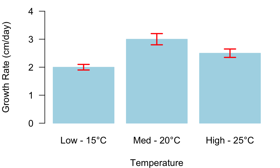
par(mar =c(4, 4, 1, 1))conditions<-c("Low - 15°C", "Med - 20°C", "High - 25°C")mean_growth_rate<-c(2, 3, 2.5)# average growth ratesse_growth_rate<-c(0.1, 0.2, 0.15)# standard errorsbar_centers<-barplot(mean_growth_rate, names.arg =conditions, ylim =c(0, 4), ylab ="Growth Rate (cm/day)", xlab ="Temperature", border ="lightblue", col ="lightblue", las =1)arrows(bar_centers,mean_growth_rate+se_growth_rate,bar_centers,mean_growth_rate-se_growth_rate, angle =90, code =3, length =0.1, lwd =2, col ="red")
Figure 1: Average growth rate of organism under different temperatures ± SEM.
Types of Figures and Their Uses
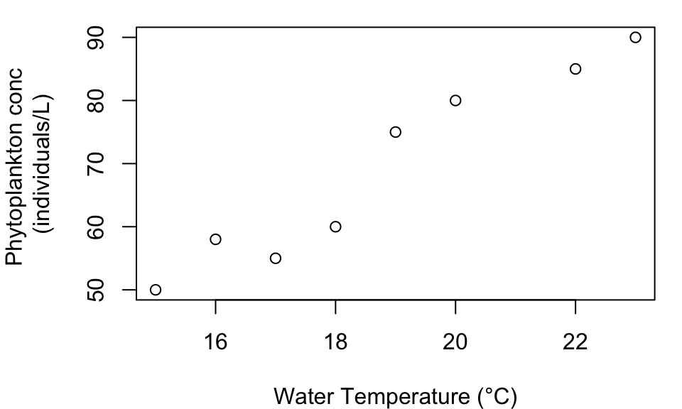
Scatterplot
Scatterplots are used to display relationships between two quantitative variables. They are particularly useful in ecological studies, such as examining the relationship between water temperature and phytoplankton concentration.
Figure 2: Water Temperature vs. Phytoplankton Concentration.
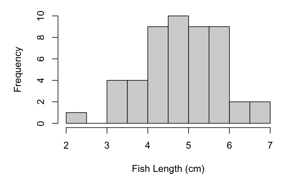
Histogram
Histograms display the distribution of a single quantitative variable. They are commonly used in population studies, such as analyzing the distribution of fish lengths in a sampled area.
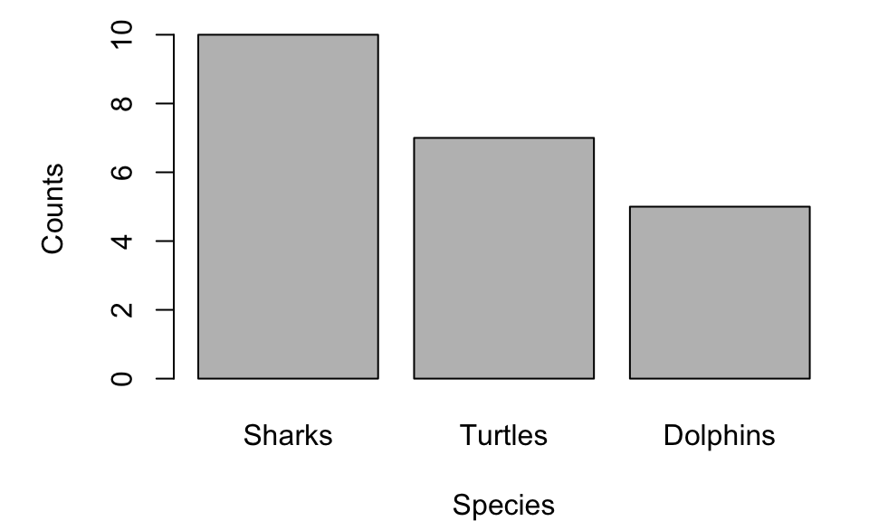
Barplots compare quantities across different categories. They are often used in ecological surveys, such as comparing species abundance in different habitats.
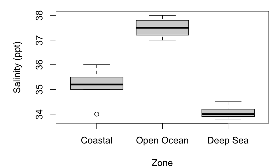
Boxplots display the distribution and spread of a quantitative variable across different categories or groups. They are particularly useful in comparative studies, such as examining salinity levels in different marine zones.
Figure 5: Salinity Levels in Different Marine Zones.
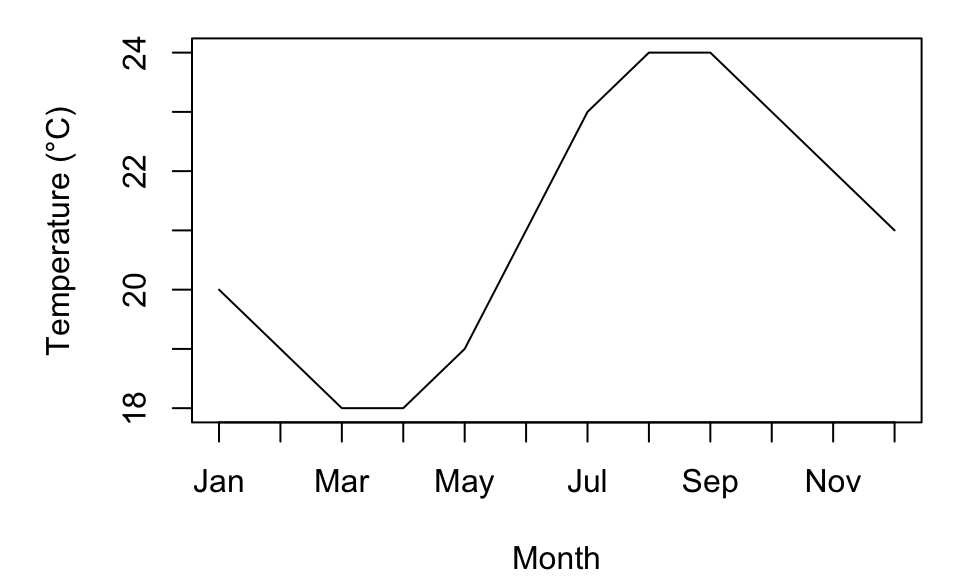
Line Plot
Line plots are used to display trends over time or continuous data. They are commonly employed in climate studies, such as tracking sea surface temperature changes over time.
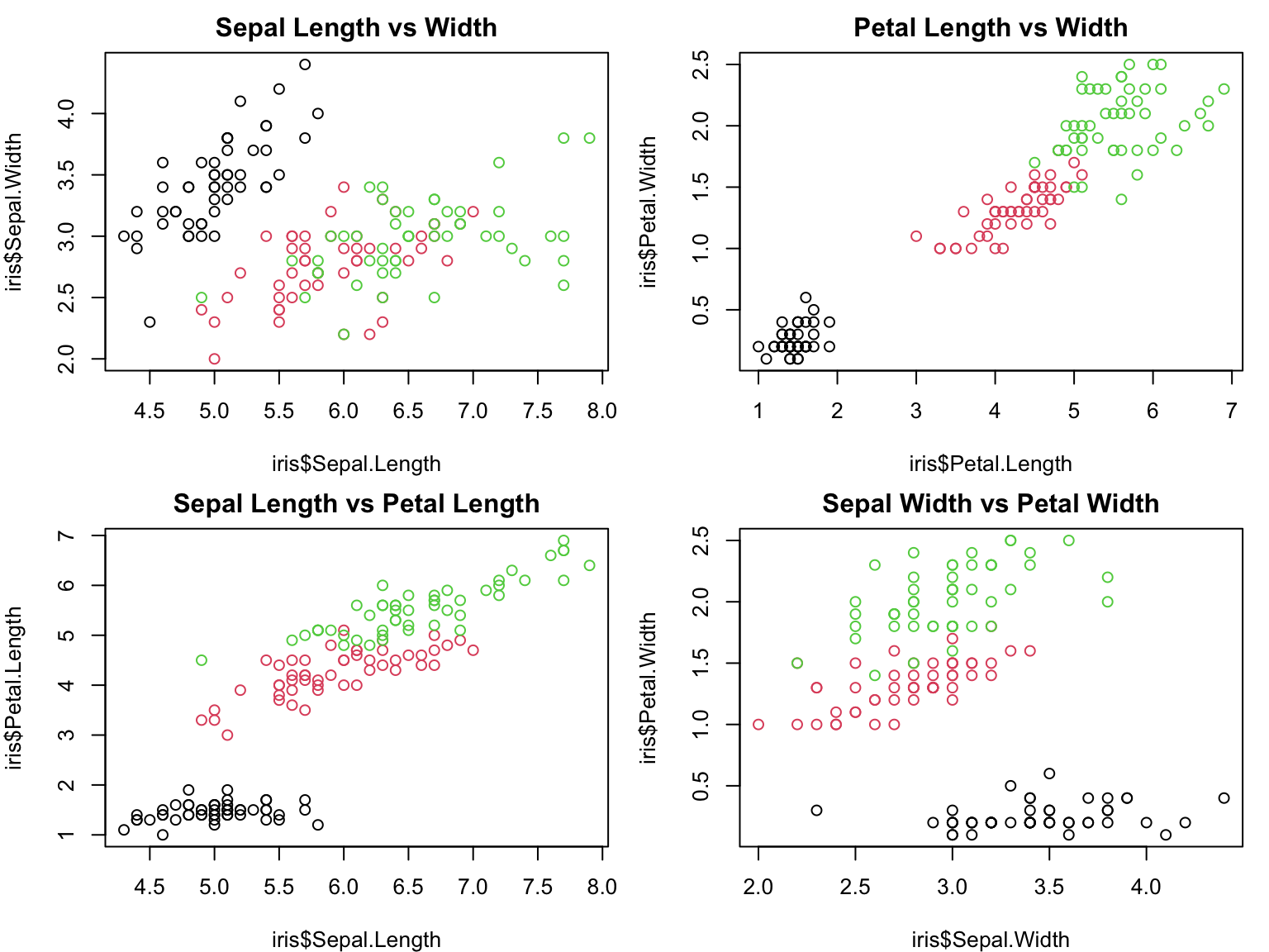
Multi-panel plots, also known as faceted plots or small multiples, allow for the comparison of multiple related datasets or variables simultaneously. They are particularly useful in complex studies where relationships between multiple variables need to be examined.
show R code
par(mfrow=c(2,2), mar=c(4,4,2,1))data(iris)plot(iris$Sepal.Length, iris$Sepal.Width, col=iris$Species, main="Sepal Length vs Width")plot(iris$Petal.Length, iris$Petal.Width, col=iris$Species, main="Petal Length vs Width")plot(iris$Sepal.Length, iris$Petal.Length, col=iris$Species, main="Sepal Length vs Petal Length")plot(iris$Sepal.Width, iris$Petal.Width, col=iris$Species, main="Sepal Width vs Petal Width")
Figure 7: Multi-panel plot showing relationships between sepal length, sepal width, petal length, and petal width in iris dataset.
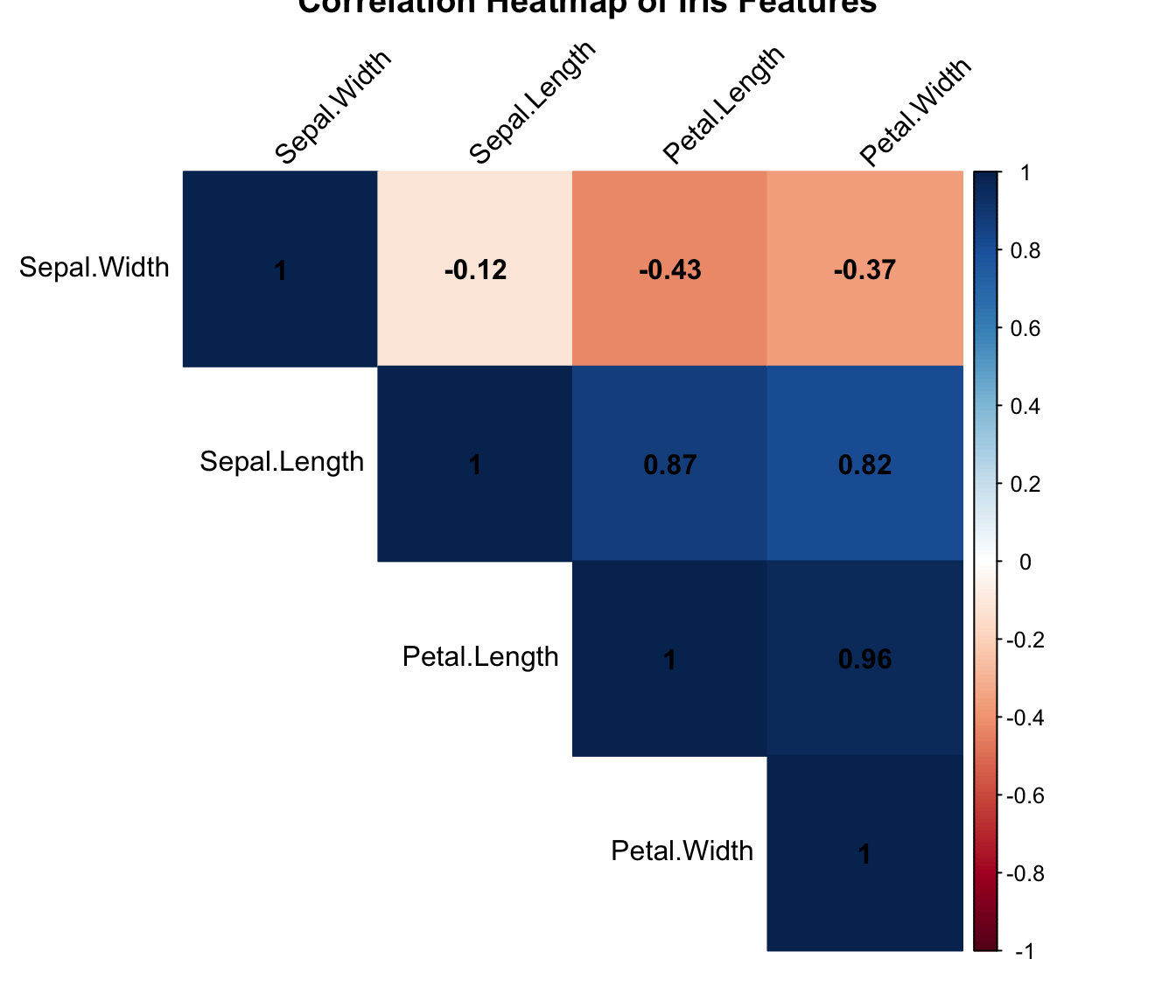
Heatmaps
Heatmaps are useful for visualizing complex, multi-dimensional data. They are commonly used in genomics, climate science, and social network analysis to reveal patterns and clusters in large datasets.
Figure 8: Heatmap of correlation matrix for iris dataset.
Dimensionality Reduction Techniques
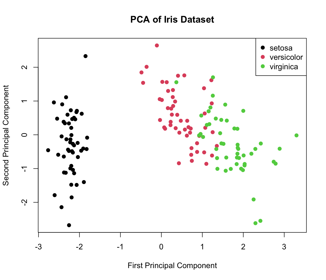
When dealing with high-dimensional data, techniques like Principal Component Analysis (PCA) or t-SNE can be used to create 2D or 3D visualizations that capture the essence of complex datasets.
show R code
pca_result<-prcomp(iris[,1:4], scale. =TRUE)plot(pca_result$x[,1:2], col=iris$Species, pch=19, xlab="First Principal Component", ylab="Second Principal Component", main="PCA of Iris Dataset")legend("topright", legend=levels(iris$Species), col=1:3, pch=19)
Figure 9: PCA plot of iris dataset.
Interactive Plots
While static plots are suitable for publications, interactive plots can be powerful tools for data exploration and presentation in digital formats (such as this lab manual!). Libraries such as plotly in R or D3.js in JavaScript allow for the creation of interactive visualizations.
Choosing the Right Visualization
Selecting the appropriate visualization type is crucial for effective data communication. Consider the following factors:
Data Type: Categorical, continuous, time-series, etc.
Number of Variables: Univariate, bivariate, or multivariate data.
Relationship of Interest: Comparison, composition, distribution, or trend.
Audience: Technical expertise of the intended audience.
Medium: Print publication, digital presentation, or interactive dashboard.
Data Visualization Ethics
Ethical considerations in data visualization are crucial:
Truthful Representation: Ensure that the visualization accurately represents the underlying data without distortion.
Context Provision: Provide sufficient context to prevent misinterpretation.
Accessibility: Consider color-blind friendly palettes and other accessibility features.
Uncertainty Communication: Clearly represent uncertainties and limitations in the data.
Now that we’ve covered the key concepts of data visualization, let’s test your understanding with a quick quiz:
Quiz: Data Visualization
1. Which plot type is best for showing the relationship between two continuous variables?
a) Bar plot b) Scatter plot c) Histogram
2. Which of the following is true about error bars?
a) You must always specify what the error bars mean somewhere in the figure caption or title b) An error bar could represent median +/- mean c) An error bar could represent mean +/- standard deviation d) Both A and C are correct
3. Which plot type is most suitable for displaying the distribution of a single continuous variable?
a) Line plot b) Box plot c) Histogram
4. What is a key consideration when choosing colors for a plot?
a) Using as many colors as possible b) Ensuring the colors are colorblind-friendly c) Always using primary colors
5. Which of the following is NOT a key element in plots?
a) Axis labels b) Use of more than 1 color c) Caption or title