When working with categorical data, frequency tables help us see patterns and relationships between variables. The xtabs() function in R creates these tables efficiently, showing how often different categories occur in our data. Let’s explore this with an example from a sports dataset:
The output shows each team’s frequency in our dataset: Team A appears 27 times, Team B 33 times, and Team C 40 times. This simple table already reveals the relative sizes of each team in our sample.
Creating Contingency Tables
When we want to examine relationships between two categorical variables, contingency tables become valuable tools. Using the same xtabs() function, we can create two-way tables that show how our categories interact. Here’s an example using a dataset about penguins:
library(palmerpenguins)data(penguins)# adjust sample for illustrationpenguins<-penguins[-sample(which(penguins$sex=="male"),80),]#create two-way frequency tabledftab<-xtabs(~species+sex, data=penguins)dftab
           sex
species     female male
  Adelie        73   39
  Chinstrap     34   17
  Gentoo        58   32
The resulting table shows the count for every combination of species and sex. Reading across rows and down columns reveals patterns in how these variables relate to each other. The xtabs() function can handle multiple variables too - just add more variables with plus signs in the formula.
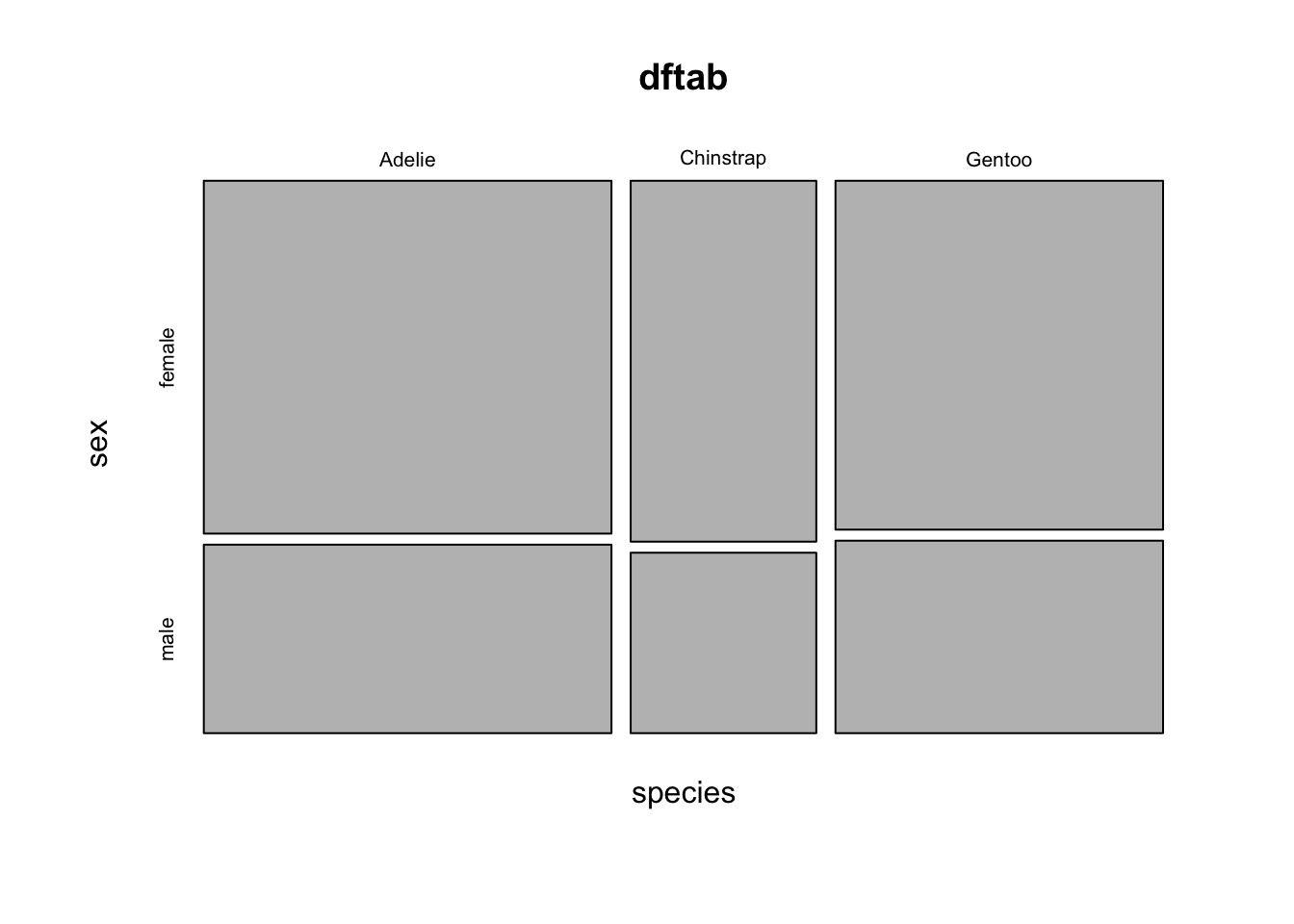
Visualizing Categorical Relationships
While tables provide precise numbers, visualizations can make patterns more immediately apparent. The mosaic plot presents categorical relationships through proportionally sized rectangles. Each rectangle’s area corresponds to the frequency of that particular combination of categories:
In this visualization, the width of each section represents the relative frequency of different species, while the height shows the proportion of males and females within each species. Larger rectangles indicate more frequent combinations, making it easy to spot predominant patterns in your data.
Think of a mosaic plot as a visual version of your contingency table - it transforms numbers into shapes that your brain can quickly process and compare. This makes it particularly useful for presenting findings to others or quickly identifying unexpected patterns in your data.