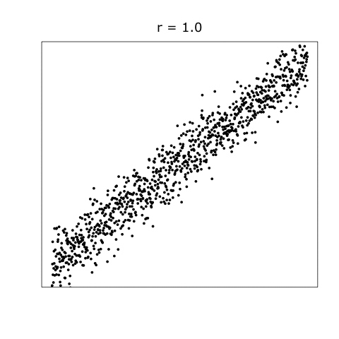
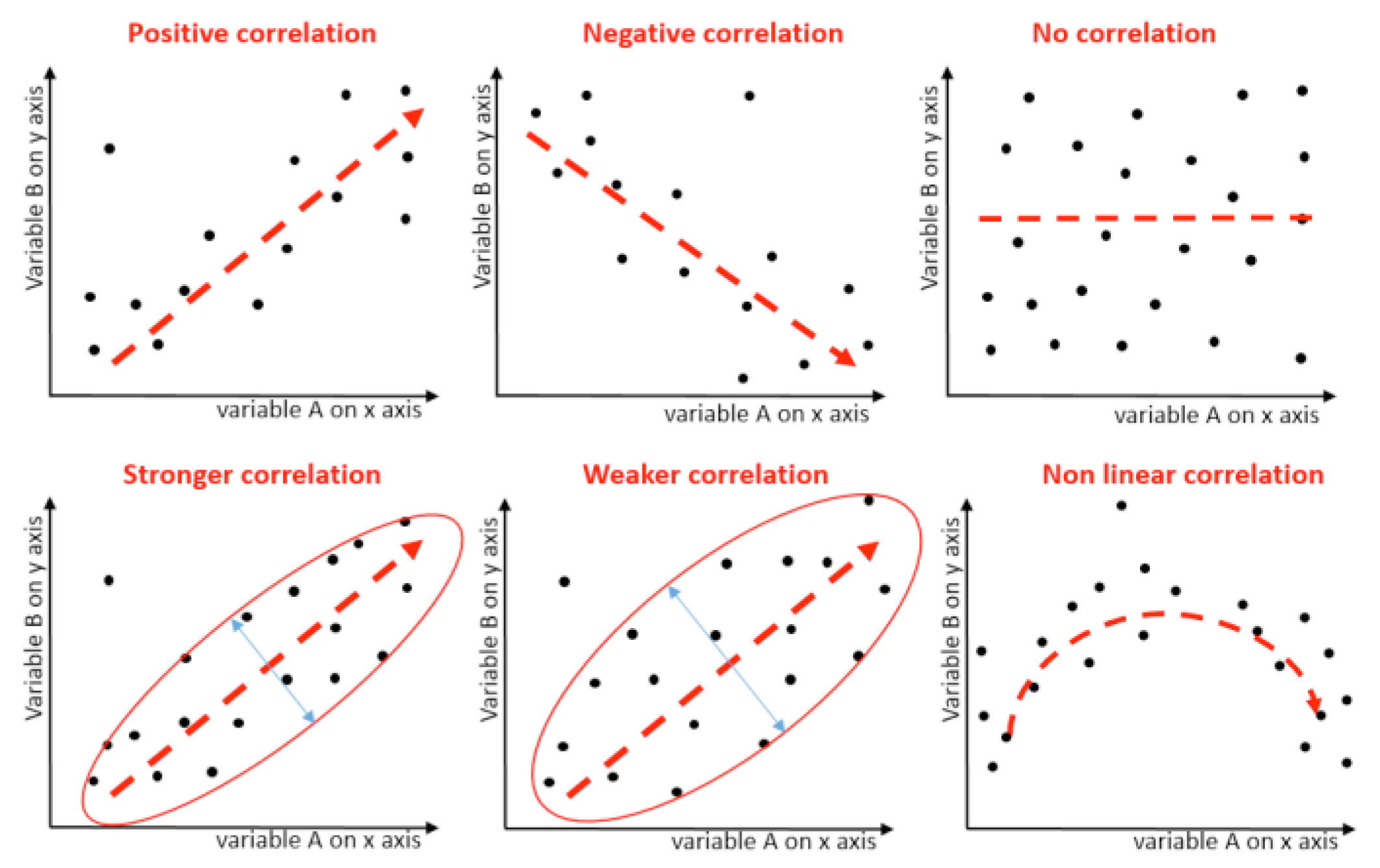
Correlation is a fundamental concept in statistics that describes the linear relationship between two quantitative variables. The strength and direction of this relationship is quantified by a correlation coefficient, typically denoted as \(r\). The value of \(r\) lies between -1 and 1, where:
\(r = 1\) implies a perfect positive linear relationship.
\(r = -1\) implies a perfect negative linear relationship.
for this section, we will look at this example dataset, called fish_survey_data
Variables:
Sea Surface Temperature (SST): Temperature of the upper few meters of the ocean. It can influence marine life directly and indirectly.
Chlorophyll Concentration: Indicates the presence of phytoplankton, the base of the marine food chain.
Salinity: The salt concentration in the water. Can influence where certain species can thrive.
Fish Abundance: Population of a particular species of fish, which can be influenced by the other variables.
Seagrass Coverage: The area covered by seagrass, a crucial habitat and food source in marine ecosystems.
Objective: To understand how environmental factors (SST, Chlorophyll Concentration, and Salinity) influence the biological components (Fish Abundance and Seagrass Coverage) of a marine ecosystem.
library(tibble)set.seed(123)# For reproducibilityfish_survey_data<-tibble( SST =rnorm(100, mean =25, sd =2), # Sea Surface Temperature in Celsius Chlorophyll =rnorm(100, mean =1.5, sd =0.3), # Chlorophyll concentration in mg/m^3 Salinity =rnorm(100, mean =35, sd =1), # Salinity in PSU Fish_Abundance =5000+20*SST+3000*Chlorophyll-50*Salinity+rnorm(100, mean =0, sd =500), Seagrass_Coverage =rnorm(100, mean =50, sd =10)# Seagrass coverage in percentage)head(fish_survey_data)# Display the first few rows of the dataset
This simulated dataset provides a foundation to explore various ecological questions related to marine ecosystems. For instance:
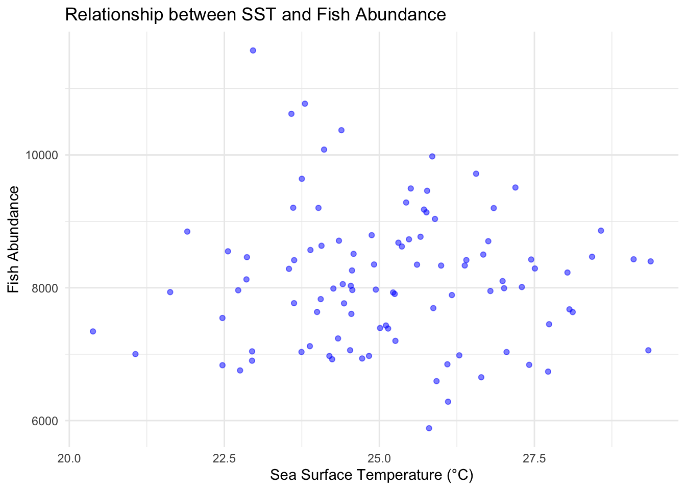
Is there a relationship between sea surface temperature and Fish Abundance?
library(ggplot2)ggplot(fish_survey_data, aes(x =SST, y =Fish_Abundance))+geom_point(color ="blue", alpha =0.5)+# geom_smooth(method = "lm", col = "red") + # Adds a linear regression linetheme_minimal()+labs(title ="Relationship between SST and Fish Abundance", x ="Sea Surface Temperature (°C)", y ="Fish Abundance")
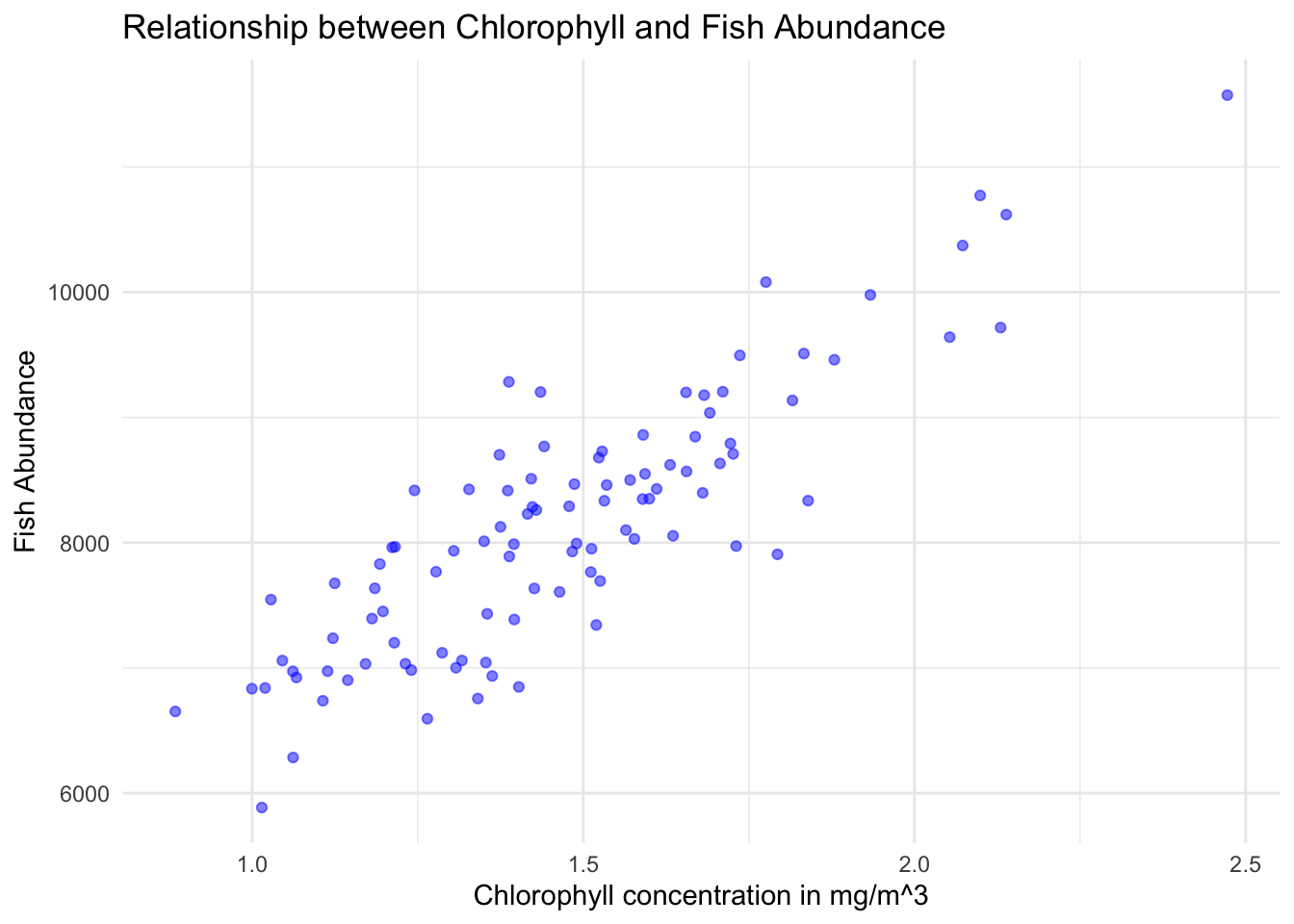
Is there a relationship between chlorophyll concentration (indicative of phytoplankton presence) and Fish Abundance?
library(ggplot2)ggplot(fish_survey_data, aes(x =Chlorophyll, y =Fish_Abundance))+geom_point(color ="blue", alpha =0.5)+# geom_smooth(method = "lm", col = "red") + # Adds a linear regression linetheme_minimal()+labs(title ="Relationship between Chlorophyll and Fish Abundance", x ="Chlorophyll concentration in mg/m^3", y ="Fish Abundance")
Pearson’s Correlation Coefficient Formula
Pearson’s correlation coefficient is calculated as the covariance of the two variables divided by the product of their standard deviations:
For the numerator, we need to calculate the sum of the product of the deviations of Chlorophyll and Fish_Abundance from their respective means (aka the covariance):
For the denominator, we’ll first calculate the square root of the sum of the squared deviations of Chlorophyll and Fish_Abundance from their means, and then multiply the two results:
An \(r\) value of \(0.86\) is a Pearson correlation coefficient, and it provides insights into the strength and direction of the linear relationship between two variables.
In the context of our dataset, an \(r\) value of \(0.86\) between Chlorophyll and Fish_Abundance suggests that as Chlorophyll increases, the Fish Abundance also tends to increase, and this relationship is strong and linear.
This relationship is fairly evident in the plot:
library(ggplot2)ggplot(fish_survey_data, aes(x =Chlorophyll, y =Fish_Abundance))+geom_point(color ="blue", alpha =0.5)+# geom_smooth(method = "lm", col = "red") + # Adds a linear regression linetheme_minimal()+labs(title ="Relationship between Chlorophyll and Fish Abundance", x ="Chlorophyll concentration in mg/m^3", y ="Fish Abundance")
Kumar, Sunil, and Ilyoung Chong. 2018. “Correlation Analysis to Identify the Effective Data in Machine Learning: Prediction of Depressive Disorder and Emotion States.”International Journal of Environmental Research and Public Health 15 (12): 2907. https://doi.org/10.3390/ijerph15122907.