Visualizing data is a crucial complement to statistical analysis. It provides an intuitive representation of patterns in the data, making complex statistical concepts more accessible. In this section, we’ll explore various plot types suitable for presenting ANOVA results.
1. Bar Charts
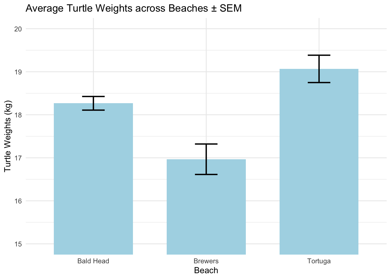
Bar charts represent the central tendency (usually the mean) of a dataset for different categories. Error bars can be added to show variability (like standard deviation or confidence intervals).
Note the different way we are plotting the bar chart here compared to past examples. This is another way to do it (there is always way more than one correct way to do a thing when coding).
ggplot(data, aes(x =beach, y =turtles))+stat_summary( fun ="mean", geom ="bar", fill ="lightblue", width =0.7)+stat_summary( fun.data =mean_se, geom ="errorbar", width =0.2, linewidth =0.8)+coord_cartesian(ylim=c(15,20))+theme_minimal()+labs(y ="Turtle Weights (kg)", x ="Beach", title ="Average Turtle Weights across Beaches ± SEM")
Pros:
Clearly displays mean values for each group. Is readible with respect to ANOVA results
With error bars, provides a sense of variability around the mean. And you get to specify which error bars you want to use.
Cons:
Might give a misleading impression of data distribution if only mean and error bars are presented.
Doesn’t show data distribution or outliers.
2. Box Plots
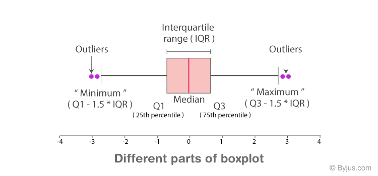
Overview: Box plots display the distribution of data based on a five-number summary: minimum, first quartile (Q1), median, third quartile (Q3), and maximum.
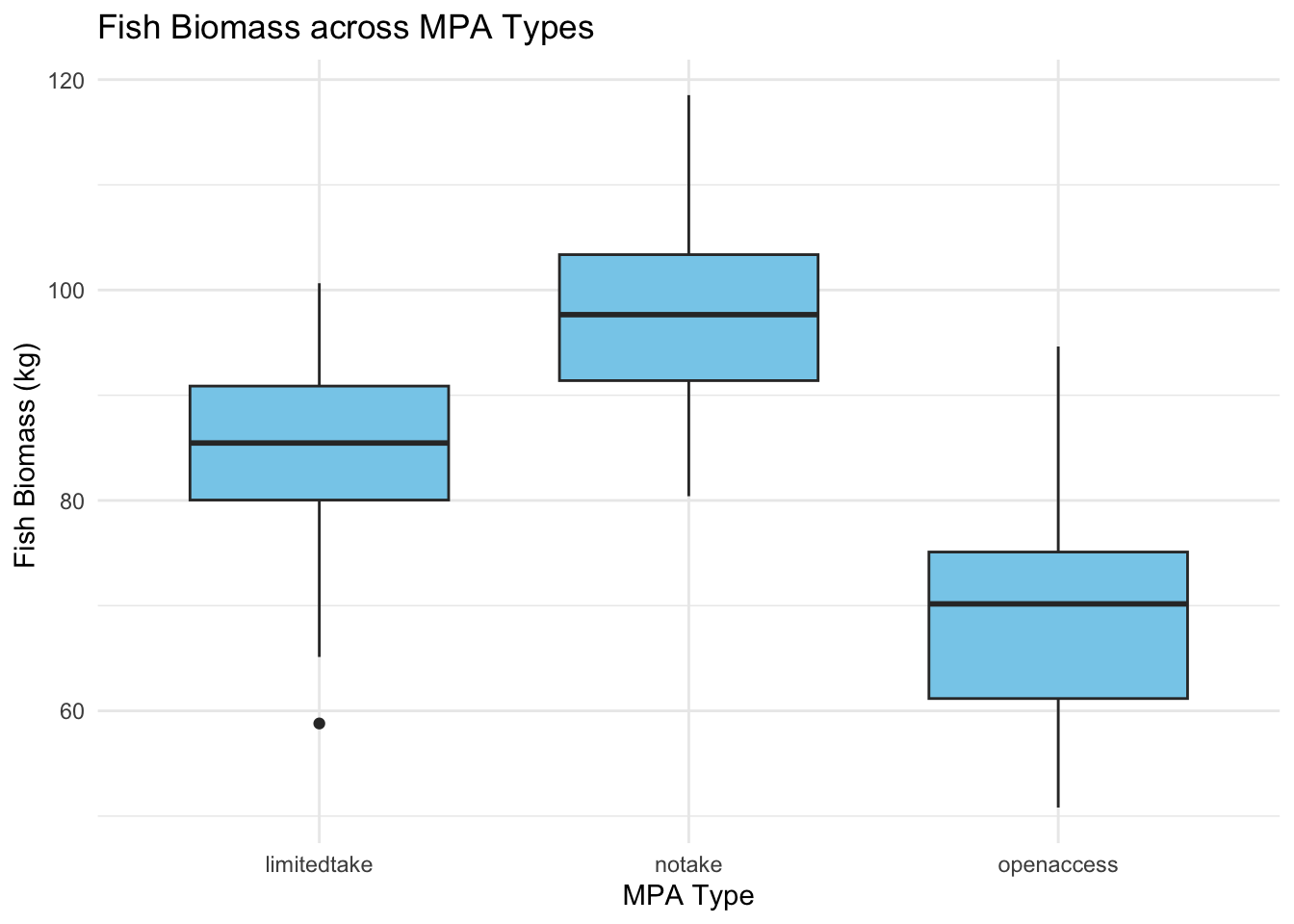
ggplot(data_fish_mpa, aes(x =MPA_Type, y =Fish_Biomass))+geom_boxplot(fill ="skyblue", width =0.7)+theme_minimal()+labs(y ="Fish Biomass (kg) ", x ="MPA Type", title ="Fish Biomass across MPA Types")
Pros:
Provides a sense of data distribution.
Clearly identifies outliers.
Displays the median, which is the central value.
Cons:
Typically displays the median and not the mean. Since ANOVA analyzes means, there might be a slight disconnect when interpreting results.
Doesn’t show data distribution in detail.
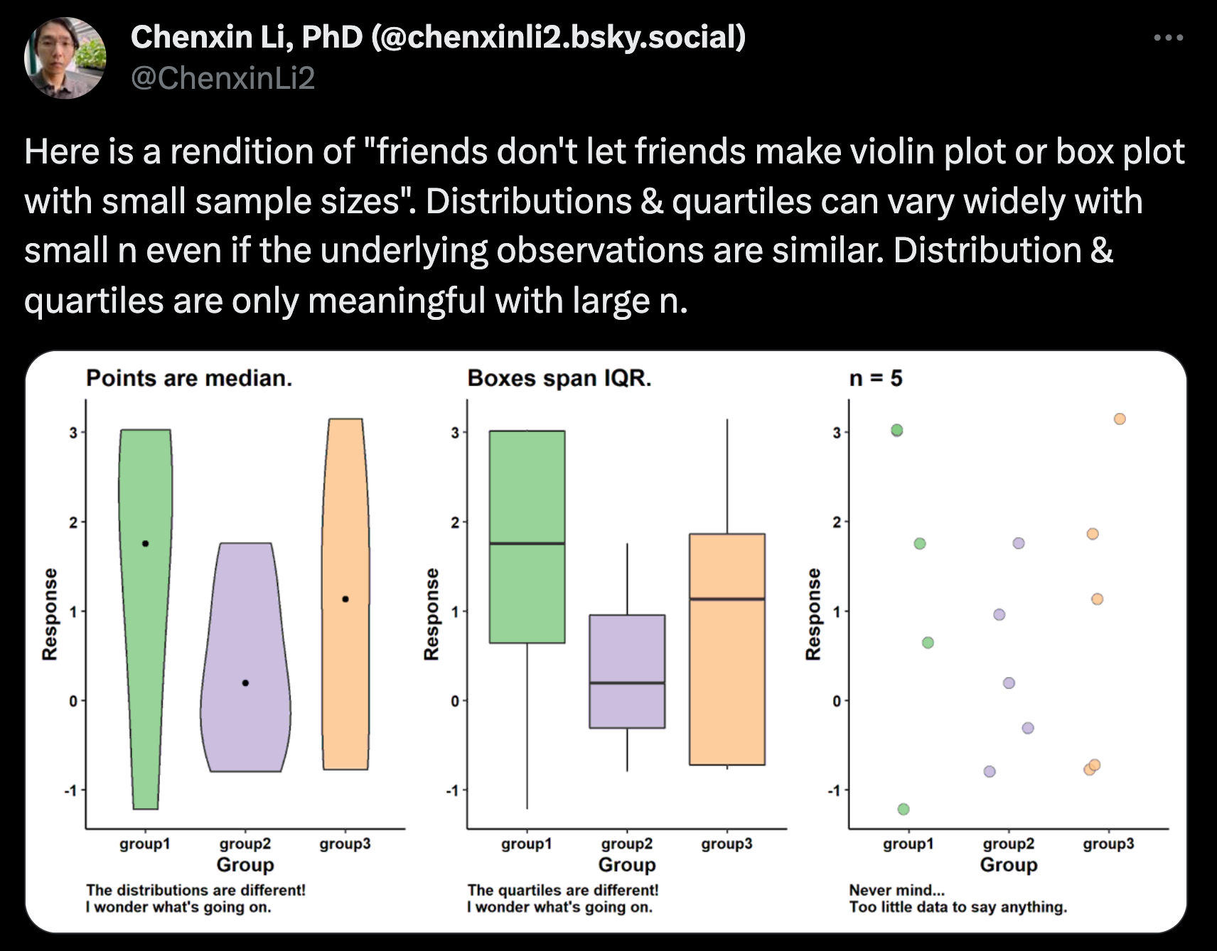
Interquartile range representation can be misleading for small sample sizes (this is perhaps most important)
3. Violin Plots
Overview: Violin plots combine box plots and kernel density plots. They provide a mirrored density plot on each side of the box plot.
ggplot(data_fish_mpa, aes(x =MPA_Type, y =Fish_Biomass))+geom_violin(fill ="skyblue")+theme_minimal()+labs(y ="Fish Biomass (kg)", x ="MPA Type", title ="Fish Biomass across MPA Types")
Pros:
Displays data distribution in more detail than a box plot.
Identifies multimodal distributions.
Includes box plot inside for medians and quartiles.
Cons:
Might be unfamiliar to some audiences.
Can be visually complex for datasets with many categories.
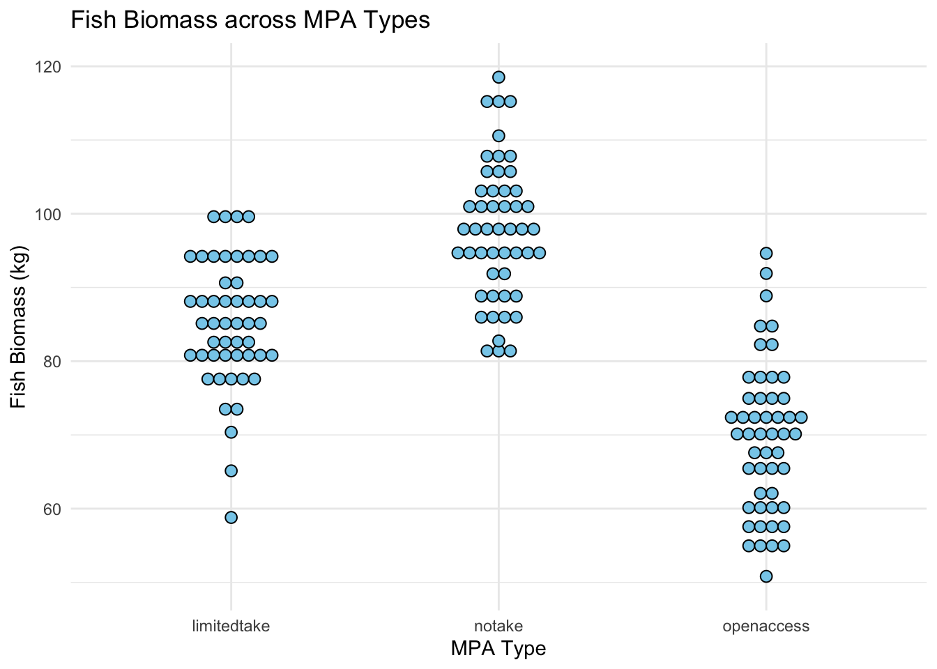
4. Dot Plots
Overview: Dot plots display all individual data points, giving a sense of data distribution, density, and variability.
ggplot(data_fish_mpa, aes(x =MPA_Type, y =Fish_Biomass))+geom_dotplot( binaxis ='y', stackdir ='center', dotsize =0.7, fill ="skyblue")+theme_minimal()+labs(y ="Fish Biomass (kg)", x ="MPA Type", title ="Fish Biomass across MPA Types")
Pros:
Displays individual data points.
Provides a sense of data density and distribution.
Identifies clusters and gaps in the data.
Cons:
Can be cluttered with large datasets (try geom_jitter)
Might be less informative about central tendency compared to other plots.
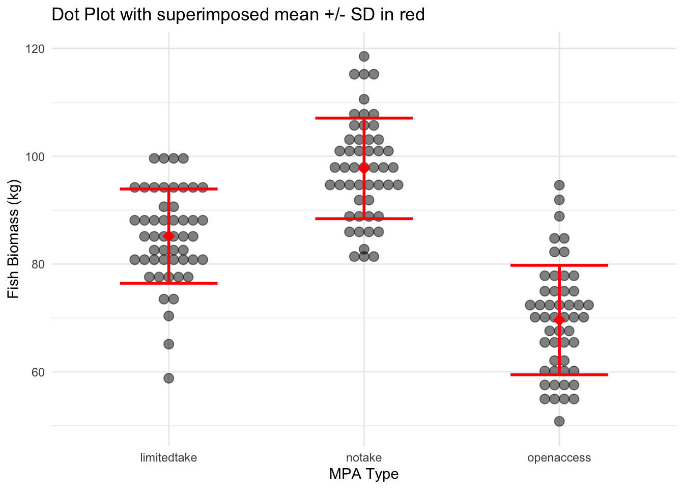
Combining plots to maximize clarity
While each type of plot offers its own insights, sometimes combining elements from multiple charts can provide a clearer picture of the data.
For instance, overlaying points with error bars on a dot plot can effectively show both data distribution and central tendency.
ggplot(data_fish_mpa, aes(x =MPA_Type, y =Fish_Biomass))+geom_dotplot( binaxis ='y', stackdir ='center', dotsize =0.8, fill ="black", alpha =0.5)+stat_summary( fun.y ="mean", geom ="point", color ="red", shape =18, size =4)+stat_summary( fun.data =mean_sdl, fun.args =list(mult =1), geom ="errorbar", width =0.5, size =1, color ="red")+theme_minimal()+labs(y ="Fish Biomass (kg)", x ="MPA Type", title ="Dot Plot with superimposed mean +/- SD in red")
Pros:
Offers a comprehensive view of both distribution and central tendency.
Provides more information in a single visual.
Cons:
Can become cluttered with too many elements.
Requires careful design to ensure clarity and readability.
Concluding points about plot choice
When visualizing data, it’s essential to remember that you have choices in how you present it. Each plot type has its strengths and weaknesses, and the decision should be based on what story you wish to tell with your data. Combining chart types can offer a richer perspective, but it’s crucial to maintain clarity and not overwhelm the viewer. The goal is always to convey information as transparently and informatively as possible.
Each of these plots provides unique insights into your data, and the choice depends on what aspects of the data you want to emphasize.
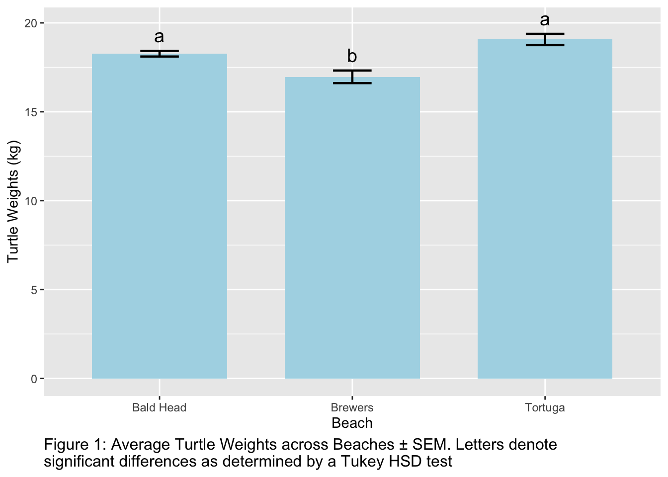
Adding Significance Letters to Plots
When performing multiple comparisons, like a Tukey HSD test, it’s common to see results presented with significance letters on plots.
Groups that share a letter are not significantly different from one another, while those with different letters are. This provides a visual way to quickly discern which groups differ significantly without having to repeatedly reference a table of p-values.
To add significance letters to a plot, you’ll first need to extract these letters from your Tukey test results.
There are 2 ways to do this, depending on what packages you want to load
option 1
This option uses TukeyHSD followed by multcompLetters from multcompView package
#install.packages("multcompView")library(multcompView)tukey_result<-TukeyHSD(anova_result,conf.level=0.95)# extracting the 4th column of the tukey result, which is the column with the significance lettersexp_letters<-multcompLetters(tukey_result$beach[, 4])$Letterstukey_result<-data.frame( beach =names(exp_letters), groups =exp_letters)rownames(tukey_result)<-NULLprint(tukey_result)
      beach groups
1   Brewers      a
2   Tortuga      b
3 Bald Head      b
option 2
This option uses HSD.test() from the agricolae package
#install.packages("agricolae")library(agricolae)tukey_result<-HSD.test(anova_result, "beach", group =TRUE)tukey_result<-data.frame( beach =rownames(tukey_result$groups), groups =tukey_result$groups$groups)print(tukey_result)
      beach groups
1   Tortuga      a
2 Bald Head      a
3   Brewers      b
summarizing and plotting
both instances of tukey_result above contains the significance letters that we are going to add to the bar plot.
We need to summarize the data for plotting, if we havent already, and then add the letters to the summary_df
# Create the summary dataframe with mean and standard deviationsummary_data<-data%>%group_by(beach)%>%summarise( mean_turtle_weight =mean(turtles), se_turtle_weight =sd(turtles)/sqrt(n()))# Extract significance letters from Tukey's result and merge with the summary dataframesummary_data<-summary_data%>%left_join(tukey_result, by ="beach")print(as.data.frame(summary_data))
      beach mean_turtle_weight se_turtle_weight groups
1 Bald Head               18.3            0.159      a
2   Brewers               17.0            0.354      b
3   Tortuga               19.1            0.318      a
Finally, have the information that we need in one dataframe to plot summary_df includinh the significance letters that we want to add (using geom_text() ) .
Note you may need to adjust vjust and size of your letters to place them correctly over the error bars.
ggplot(summary_data, aes(x =beach, y =mean_turtle_weight))+geom_bar(stat ="identity", fill ="lightblue", width =0.7)+geom_errorbar(aes(ymin =mean_turtle_weight-se_turtle_weight, ymax =mean_turtle_weight+se_turtle_weight), width =0.2, linewidth =0.8)+geom_text(aes(label =groups, y =mean_turtle_weight+se_turtle_weight+0.5), vjust =0, size =5)+labs(y ="Turtle Weights (kg)", x ="Beach", caption =str_wrap("Figure 1: Average Turtle Weights across Beaches ± SEM. Letters denote significant differences as determined by a Tukey HSD test "))+theme(plot.caption =element_text(size =12, hjust =0))
Note we also add a caption in this plot instead of a title to make it look more publication-like! You may use titles or captiosn to write your figure captions (required for all plots you ever make to show to someone else).
Saving Your Plots in R
Tip
This is a helpful guide, but I will not ask you to submit saved plots to me in this lab.
After creating a plot in R, you’ll often want to save it to use in presentations, reports, or publications. R provides functions that allow you to save your plots in various formats including JPEG, TIFF, PNG, and PDF. Here’s how you can save your plots using the jpeg() and tiff() functions:
To save your plot as a JPEG, you can use the jpeg() function. This function opens a graphics device where any subsequent plotting command will be saved as an image.
# Open a JPEG graphics devicejpeg("my_plot.jpeg", width=800, height=600, res=120, quality=100)# Plot command(s)ggplot(data_fish_mpa, aes(x=MPA_Type, y=Fish_Biomass))+geom_boxplot()# Close the devicedev.off()
Arguments:
"my_plot.jpeg": Filename for the saved image.
width & height: Size of the image in pixels.
res: Resolution of the image in pixels per inch.
quality: Quality of the JPEG (ranges from 0 to 100).
Similarly, to save your plot as a TIFF, you can use the tiff() function.
# Open a TIFF graphics devicetiff("my_plot.tiff", width=5, height=4, units="in", res=300, compression="lzw")# Plot command(s)ggplot(data_fish_mpa, aes(x=MPA_Type, y=Fish_Biomass))+geom_violin()# Close the devicedev.off()
Arguments:
"my_plot.tiff": Filename for the saved image.
width & height: Size of the image in specified units (default is in inches).
units: Units for width and height (e.g., “px”, “cm”, “in”).
res: Resolution of the image in pixels per inch.
compression: Compression method for TIFF (e.g., “lzw”, “none”).
This section provides a basic overview. There are other arguments and details that you might need depending on the specific requirements of your plots, so always refer to the R documentation (?jpeg or ?tiff) if you need more advanced options.