# A tibble: 6 × 11
  manufacturer model displ  year   cyl trans      drv     cty   hwy fl    class
  <chr>        <chr> <dbl> <int> <int> <chr>      <chr> <int> <int> <chr> <chr>
1 audi         a4      1.8  1999     4 auto(l5)   f        18    29 p     compa…
2 audi         a4      1.8  1999     4 manual(m5) f        21    29 p     compa…
3 audi         a4      2    2008     4 manual(m6) f        20    31 p     compa…
4 audi         a4      2    2008     4 auto(av)   f        21    30 p     compa…
5 audi         a4      2.8  1999     6 auto(l5)   f        16    26 p     compa…
6 audi a4 2.8 1999 6 manual(m5) f 18 26 p compa…Advanced data visualization with ggplot
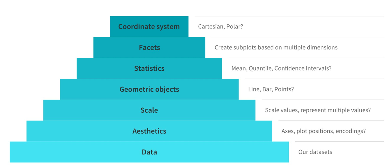
A. Main components of the grammar of graphics
Typically, to build or describe any visualization with one or more dimensions, we can use the components as follows (source)
The Grammar of Graphics: Building Plots Layer by Layer
The grammar of graphics is a powerful framework for creating data visualizations. It breaks down the process of making a plot into distinct components, allowing you to build complex visualizations step by step. Let’s explore this concept using R’s ggplot2 package, which implements the grammar of graphics.
The Basic Components
At its core, the grammar of graphics consists of several key components:
Data: The dataset you want to visualize
Aesthetics: How your data maps to visual properties
Geometries: The shapes used to represent your data
Scales: How the data is mapped to the plot
Facets: How to split your plot into subplots
Themes: The overall visual style of your plot
Let’s build a plot incrementally to see how these components work together.
Building a Plot Step by Step
We’ll use a simple dataset about car fuel efficiency for our examples.
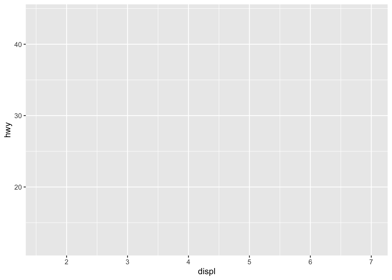
Step 1: Start with Data
The first step is to specify your data:
p <- ggplot(mpg)
p
This creates a blank canvas. Nothing exciting yet, but it’s the foundation for our plot.
Step 2: Add Aesthetics
Next, we map variables in our data to visual properties:
We’ve defined our x and y axes, but still no points appear because we haven’t told ggplot how to represent the data.
Step 3: Add Geometry
Now let’s add a geometry to represent our data points:
p <- ggplot(mpg, aes(x = displ, y = hwy)) +
  geom_point()
p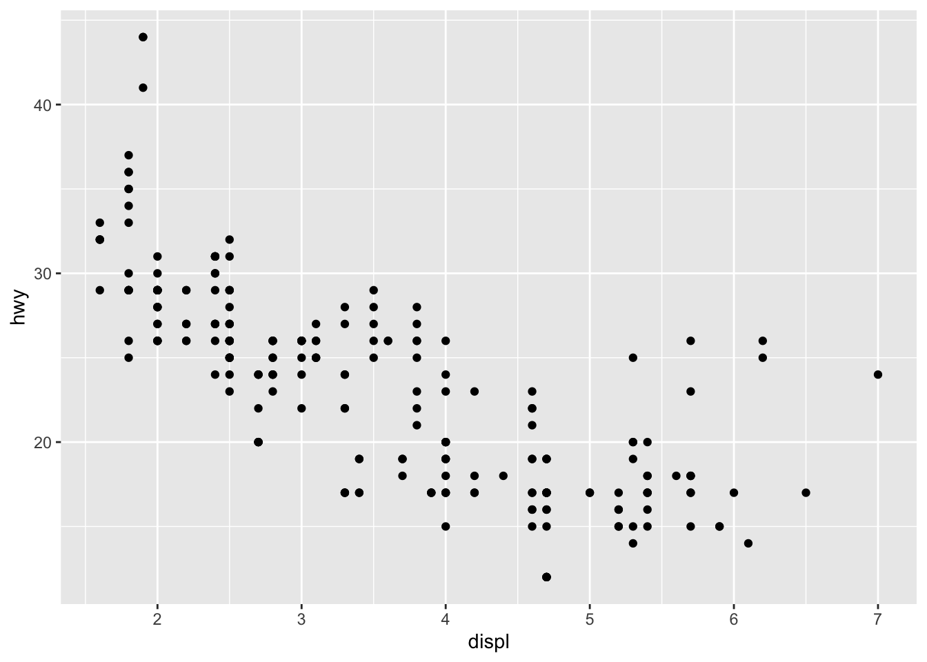
Now we see our data! Each point represents a car, with engine displacement on the x-axis and highway fuel efficiency on the y-axis.
Step 4: Enhance with More Aesthetics
We can map more variables to other visual properties:
p <- ggplot(mpg, aes(x = displ, y = hwy, color = class)) +
  geom_point()
p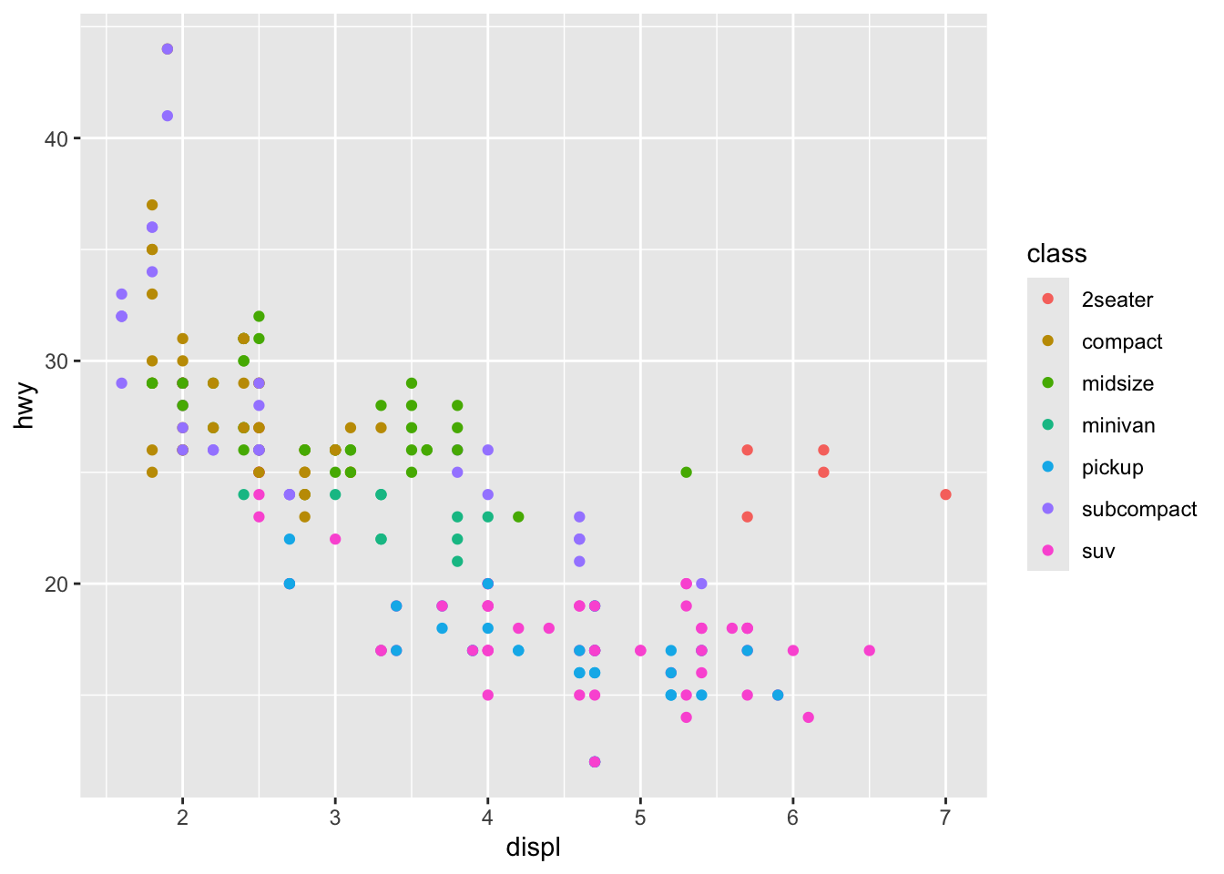
Now the color of each point represents the class of the car.
Step 5: Add Another Geometry
Let’s add a trend line to our plot:
p <- ggplot(mpg, aes(x = displ, y = hwy, color = class)) +
  geom_point() +
  geom_smooth(method = "lm", se = FALSE)
p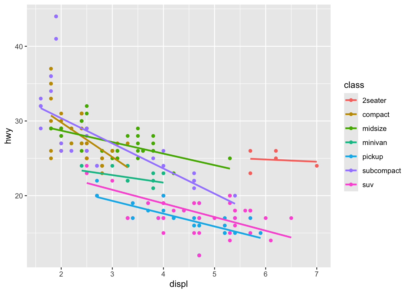
We’ve added a linear regression line for each class.
Step 6: Modify Scales
We can adjust how our data is mapped to the plot:
p <- ggplot(mpg, aes(x = displ, y = hwy, color = class)) +
  geom_point() +
  geom_smooth(method = "lm", se = FALSE) +
  scale_x_continuous(limits = c(1, 7)) +
  scale_y_continuous(limits = c(10, 45))
p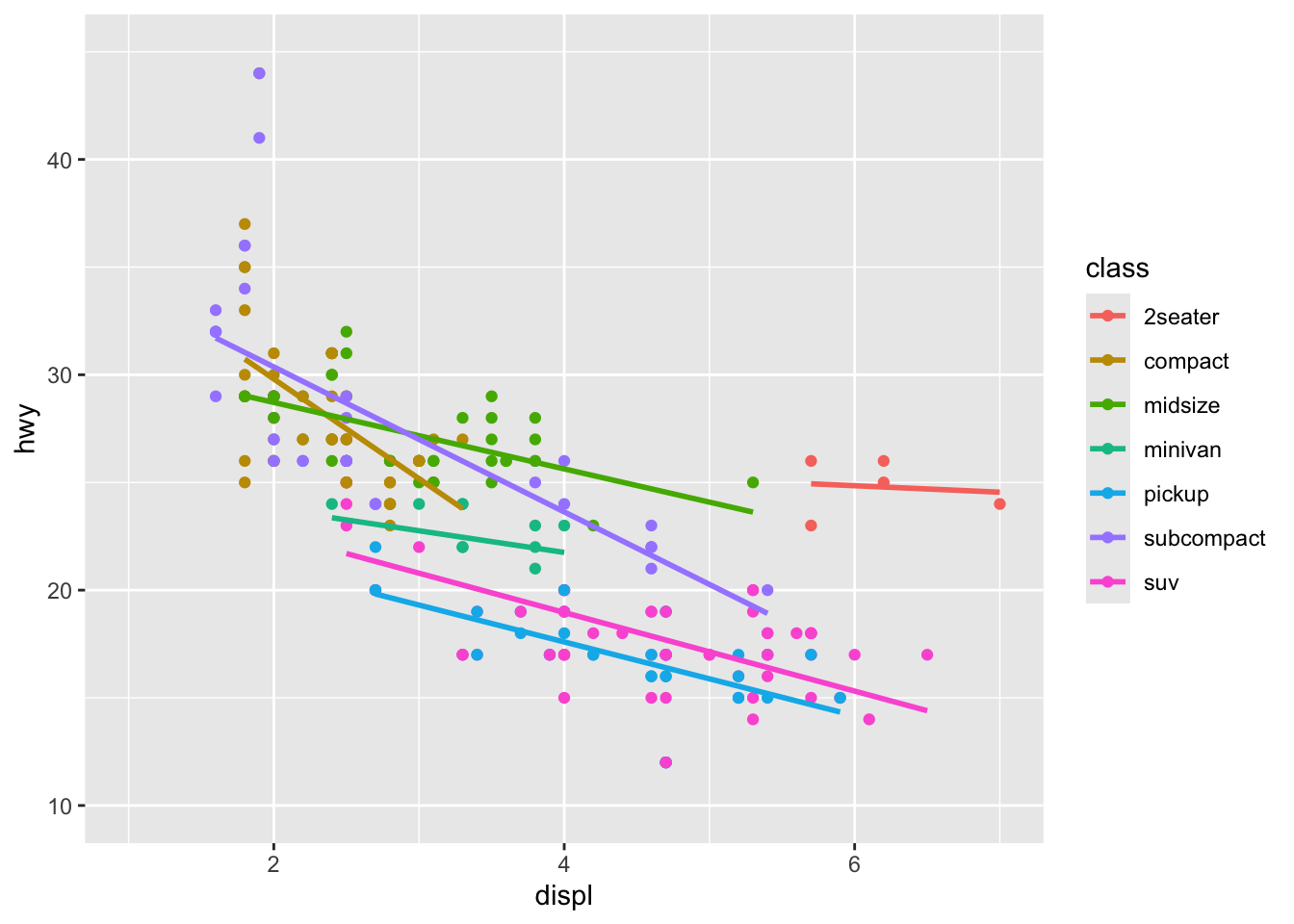
We’ve adjusted the limits of our x and y axes for better focus on our data.
Step 7: Add Facets
To compare across categories, we can split our plot into subplots:
p <- ggplot(mpg, aes(x = displ, y = hwy, color = class)) +
  geom_point() +
  geom_smooth(method = "lm", se = FALSE) +
  scale_x_continuous(limits = c(1, 7)) +
  scale_y_continuous(limits = c(10, 45)) +
  facet_wrap(~year)
p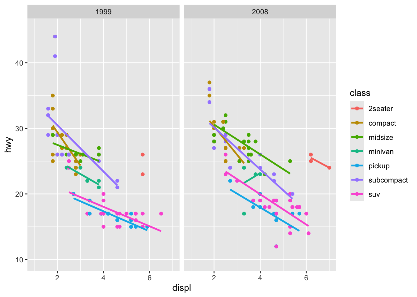
Now we have separate plots for each year in our dataset.
Step 8: Refine with Themes
Finally, let’s adjust the overall look of our plot:
p <- ggplot(mpg, aes(x = displ, y = hwy, color = class)) +
  geom_point() +
  geom_smooth(method = "lm", se = FALSE) +
  scale_x_continuous(limits = c(1, 7)) +
  scale_y_continuous(limits = c(10, 45)) +
  facet_wrap(~year) +
  theme_minimal() +
  labs(title = "Car Efficiency vs Engine Size",
       x = "Engine Displacement (L)",
       y = "Highway MPG",
       color = "Car Class")
p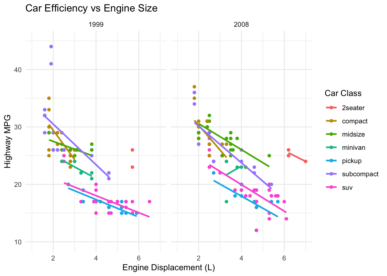
We’ve added a minimal theme and proper labels to our plot.
Lets explore more and other ggplot functions
B. Boxplots with Significance Letters
Boxplots are great for visualizing the central tendency and dispersion of a continuous variable across different categories. Adding significance letters aids in quickly conveying statistical differences between groups.
Example: Comparing shell lengths across different mussel species.
# Load necessary library
library(ggplot2)

# Simulating data
set.seed(123)
data_box <- data.frame(
  species = rep(c("A", "B", "C"), each=30),
  shell_length = c(rnorm(30, mean=50, sd=10),
                   rnorm(30, mean=60, sd=10),
                   rnorm(30, mean=50, sd=10))
)

# Creating a separate data frame for labels
labels <- data.frame(
  species = c("A", "B", "C"),
  y = c(75, 90, 75),  # y position of labels, adjust as needed
  label = c("a", "b", "a")
)

# Creating a ggplot
p <- ggplot(data_box) +
  geom_boxplot(aes(x = species, y = shell_length, fill = species), show.legend =
                 FALSE) +
  geom_text(data=labels, aes(x=species, y=y, label=label), color="black", size = 10) +
  labs(x="Species", y="Shell Length") +
  theme_minimal()

# Displaying the plot
p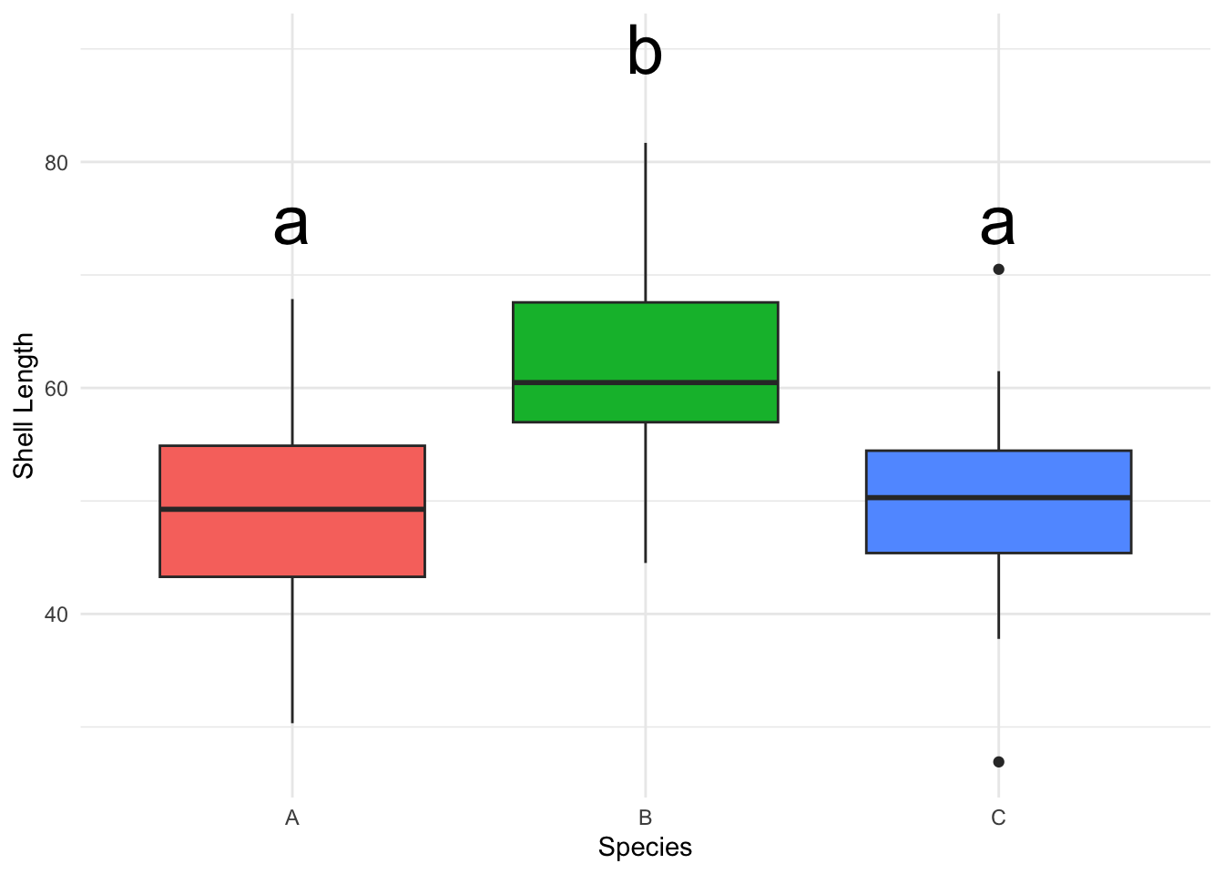
C. Heatmaps
Heatmaps display numerical values as colors, often used to represent how a response variable changes across two categorical variables.
Example: Visualizing phytoplankton abundance across various depths and months.
# Simulating data
set.seed(123)
data_heatmap <- expand.grid(month=1:12, depth=1:100)
data_heatmap$abundance <- rnorm(1200, mean=15, sd=5)

# Heatmap
p_heatmap <- ggplot(data_heatmap, aes(x=month, y=depth)) +
  geom_tile(aes(fill=abundance), color="white") +
  scale_fill_gradient(low="blue", high="yellow") +
  labs(x="Month", y="Depth", fill="Abundance") +
  theme_minimal()
p_heatmap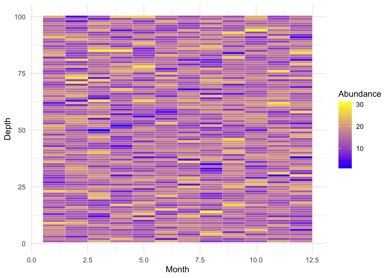
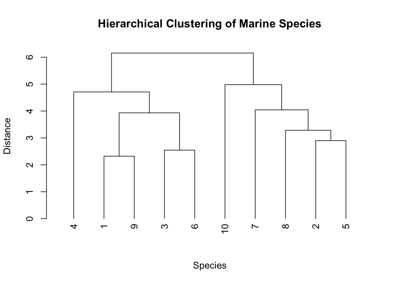
D. Dendrograms
Dendrograms provide a visual representation of the arrangement of clusters produced by hierarchical clustering.
Example: Understanding genetic similarities between different marine algae species.
E. Pie Charts
Pie Charts visualize categorical data as slices of a pie, where each slice represents the proportion of each category.
Example: Displaying proportions of different substrates in a coral reef area.
# Simulating data
data_pie <- data.frame(substrate=c("Sponge", "Algae", "Coral"), count=c(10, 60, 30))

# Pie chart
p_pie <- ggplot(data_pie, aes(x="", y=count, fill=substrate)) +
  geom_bar(stat="identity", width=1) +
  coord_polar("y") +
  labs(x=NULL, y=NULL, title="Proportion of Benthic Cover") +
  theme_minimal()
p_pie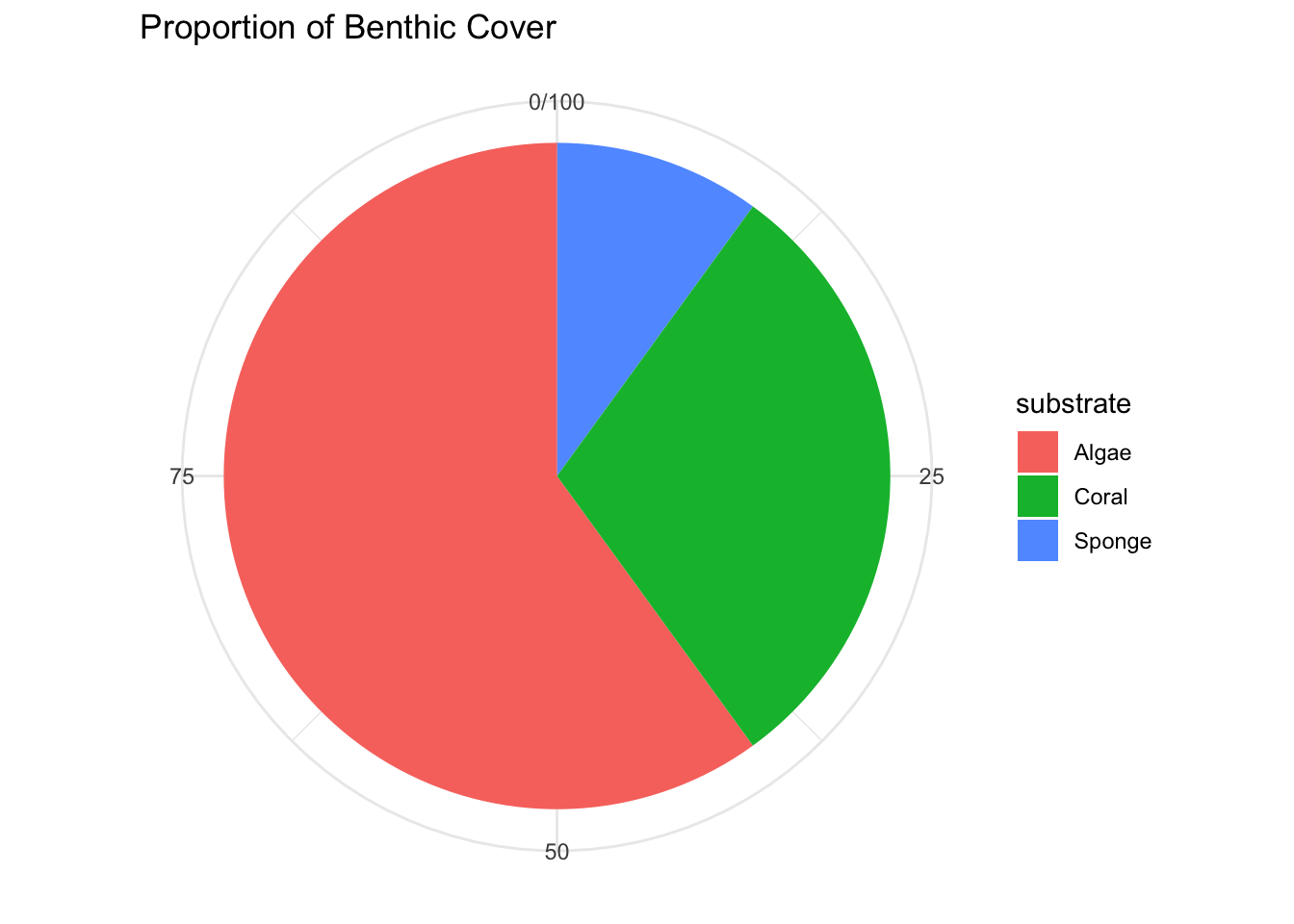
F. Temperature/Depth Profiles
Temperature/Depth Profiles demonstrate how a variable (e.g., temperature) changes across different depths, providing a clear visual depiction of trends or patterns.
Example: Observing ocean temperature variations at different depths.
# Load necessary library
library(ggplot2)
library(dplyr)

# Existing data
data <- data.frame(
  date = rep("9/28/2019", 10),
  station = rep("S4.5", 10),
  depth = c(0, 10, 20, 30, 40, 50, 75, 100, 125, 150),
  abs = c(0.049, 0.049, 0.054, 0.054, 0.056, 0.062, 0.065, 0.085, 0.094, 0.089),
  conc = c(36.69231, 36.69231, 40.53846, 40.53846, 42.07692, 46.69231, 49.00000, 64.38462, 71.30769, 67.46154)
)

# Adding a temperature column with a thermocline
data <- data %>%
  mutate(
    temperature = case_when(
      depth <= 20  ~ 25 - depth * 0.2,  # Warm, near-surface layer
      depth <= 100 ~ 21 - (depth - 20) * 0.07,  # Rapid cooling in the thermocline
      TRUE         ~ 14.5 - (depth - 100) * 0.01  # Cold, deep layer
    )
  )

# Displaying the first few rows of the updated data
head(data)
date station depth abs conc temperature
1 9/28/2019 S4.5 0 0.049 36.69231 25.0
2 9/28/2019 S4.5 10 0.049 36.69231 23.0
3 9/28/2019 S4.5 20 0.054 40.53846 21.0
4 9/28/2019 S4.5 30 0.054 40.53846 20.3
5 9/28/2019 S4.5 40 0.056 42.07692 19.6
6 9/28/2019 S4.5 50 0.062 46.69231 18.9# Plotting the Data
# Creating the plot as per your specifications
p <- ggplot(data, aes(x=depth, y=temperature)) +
geom_line(color="red", size=1, linetype=2) +
geom_point() +
scale_x_reverse() +
# scale_y_continuous(position="right") +
coord_flip() +
labs(x="Depth (m)", y="Temperature (degrees C)") +
theme_minimal()
# Displaying the plot
p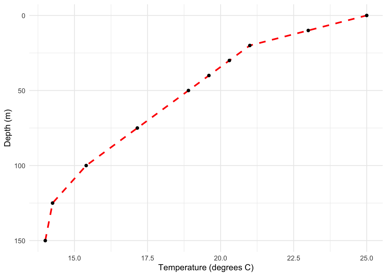
G. Violin Plots
Violin Plots combine boxplots and kernel density estimation, allowing you to visualize both the distribution and descriptive statistics of the data.
Example: Comparing light absorption levels across different coral species.
# Simulating data
set.seed(123)
data_violin <- data.frame(
  species=rep(c("X", "Y", "Z"), each=30),
  absorption=c(rnorm(30, 0.5, 0.1), rnorm(30, 0.6, 0.1), rnorm(30, 0.7, 0.1))
)

# Violin Plot
p_violin <- ggplot(data_violin, aes(x=species, y=absorption, fill=species)) +
  geom_violin(show.legend=FALSE) +
  geom_boxplot(width=0.1) +
  labs(x="Species", y="Light Absorption") +
  theme_minimal()
p_violin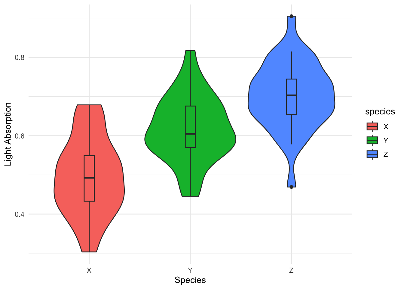
H. Faceting
Faceting involves creating multiple plots which share the same variables and view, aiding in analyzing interactions and patterns.
Example: Observing fish abundance across different months and regions.
# Simulating data
set.seed(123)
data_facet <- expand.grid(month=1:12, region=c("A", "B"), species=c("tuna", "fairy basslet"))
data_facet$abundance <- rpois(48, lambda=20)

# Faceting
p_facet <- ggplot(data_facet, aes(x=month, y=abundance, color=species)) +
  geom_line() +
  facet_wrap(~region) +
  labs(x="Month", y="Fish Abundance") +
  theme_bw()
p_facet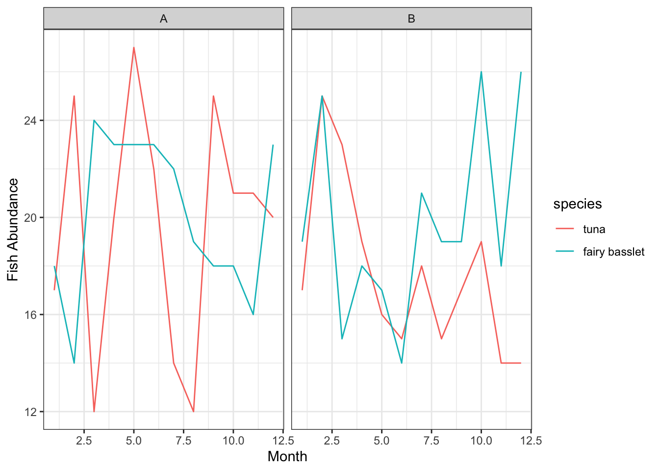
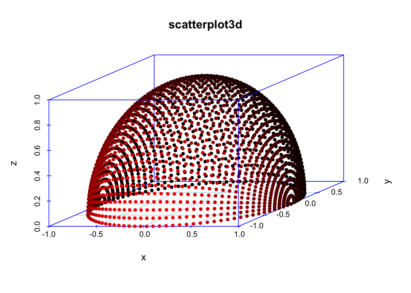
I. 3D Plots
3D Plots enable visualization of three variables simultaneously, though they are often advised against due to potential misinterpretation.
Example: Visualizing some x y and zs that make a shape
# 3D Plot using scatterplot3d
#install.packages("scatterplot3d")
library(scatterplot3d)

temp <- seq(-pi, 0, length = 50)
x <- c(rep(1, 50) %*% t(cos(temp)))
y <- c(cos(temp) %*% t(sin(temp)))
z <- c(sin(temp) %*% t(sin(temp)))

scatterplot3d(
  x,
  y,
  z,
  highlight.3d = TRUE,
  col.axis = "blue",
  col.grid = "lightblue",
  main = "scatterplot3d",
  pch = 20
)
Another cool example:
## example 6; by Martin Maechler
cubedraw <-
  function(res3d,
           min = 0,
           max = 255,
           cex = 2,
           text. = FALSE)
  {
    ## Purpose: Draw nice cube with corners
    cube01 <-
      rbind(c(0, 0, 1),
            0,
            c(1, 0, 0),
            c(1, 1, 0),
            1,
            c(0, 1, 1),
            # < 6 outer
            c(1, 0, 1),
            c(0, 1, 0)) # <- "inner": fore- & back-ground
    cub <- min + (max - min) * cube01
    ## visibile corners + lines:
    res3d$points3d(cub[c(1:6, 1, 7, 3, 7, 5) , ],
                   cex = cex,
                   type = 'b',
                   lty = 1)
    ## hidden corner + lines
    res3d$points3d(cub[c(2, 8, 4, 8, 6),],
                   cex = cex,
                   type = 'b',
                   lty = 3)
    if (text.)
      ## debug
      text(
        res3d$xyz.convert(cub),
        labels = 1:nrow(cub),
        col = 'tomato',
        cex = 2
      )
  }
## 6 a) The named colors in R, i.e. colors()
cc <- colors()
crgb <- t(col2rgb(cc))
par(xpd = TRUE)
rr <- scatterplot3d(
  crgb,
  color = cc,
  box = FALSE,
  angle = 24,
  xlim = c(-50, 300),
  ylim = c(-50, 300),
  zlim = c(-50, 300)
)
cubedraw(rr)
## 6 b) The rainbow colors from rainbow(201)
rbc <- rainbow(201)
Rrb <- t(col2rgb(rbc))
rR <- scatterplot3d(
  Rrb,
  color = rbc,
  box = FALSE,
  angle = 24,
  xlim = c(-50, 300),
  ylim = c(-50, 300),
  zlim = c(-50, 300)
)
cubedraw(rR)
rR$points3d(Rrb, col = rbc, pch = 16)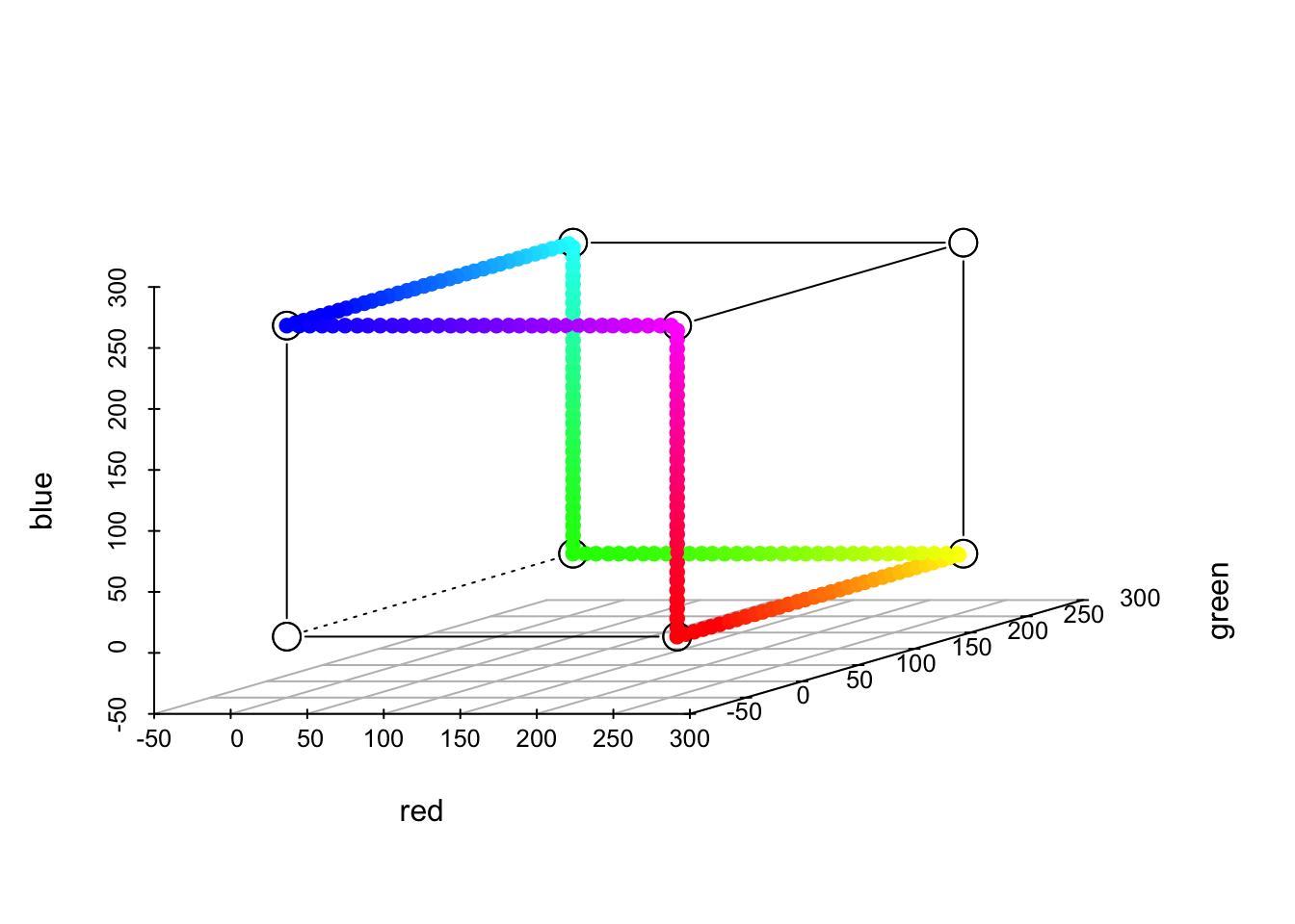
J. Network Diagrams
Network Diagrams illustrate relationships between entities, useful for showing connections within a dataset.
Example: Visualizing a marine food web.
# Simulating data
set.seed(123)
data_network <- data.frame(from=c("algae", "algae", "small_fish", "small_fish", "large_fish"),
                           to=c("small_fish", "crab", "large_fish", "shrimp", "shark"))

# Network Diagram using igraph
library(igraph)
p_network <- graph_from_data_frame(data_network, directed=TRUE)
plot(p_network, edge.arrow.size=0.5, vertex.size=15, vertex.label.cex=0.8,
     main="Marine Food Web", vertex.color="skyblue")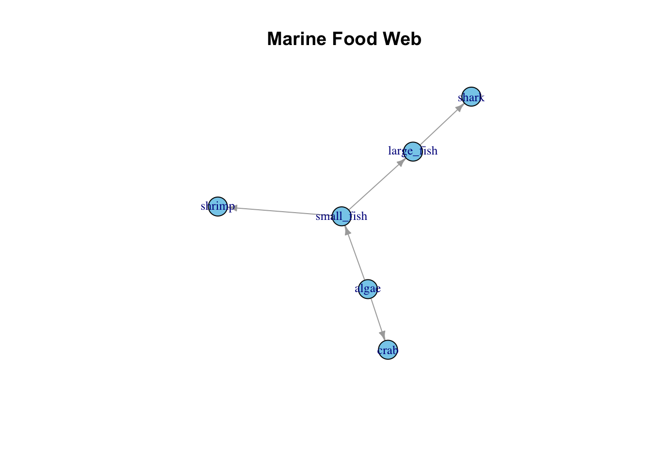
K. Maps
Maps allow the visualization of spatial patterns in data across geographical locations.
Example: Displaying shark sightings along a coast.
# Simulating data
set.seed(123)
data_map <- data.frame(lon=rnorm(10, mean=-80, sd=0.6), lat=rnorm(10, mean=25, sd=0.8))

# Maps using ggplot
p_map <- ggplot(data_map, aes(x=lon, y=lat)) +
  borders("world", colour="gray80") +
  geom_point(color="blue", size=3, alpha=0.6) +
  labs(x="Longitude", y="Latitude", title="Shark Sightings") +
  coord_cartesian(xlim=c(-85, -75), ylim=c(22, 28)) +
  theme_minimal()
p_map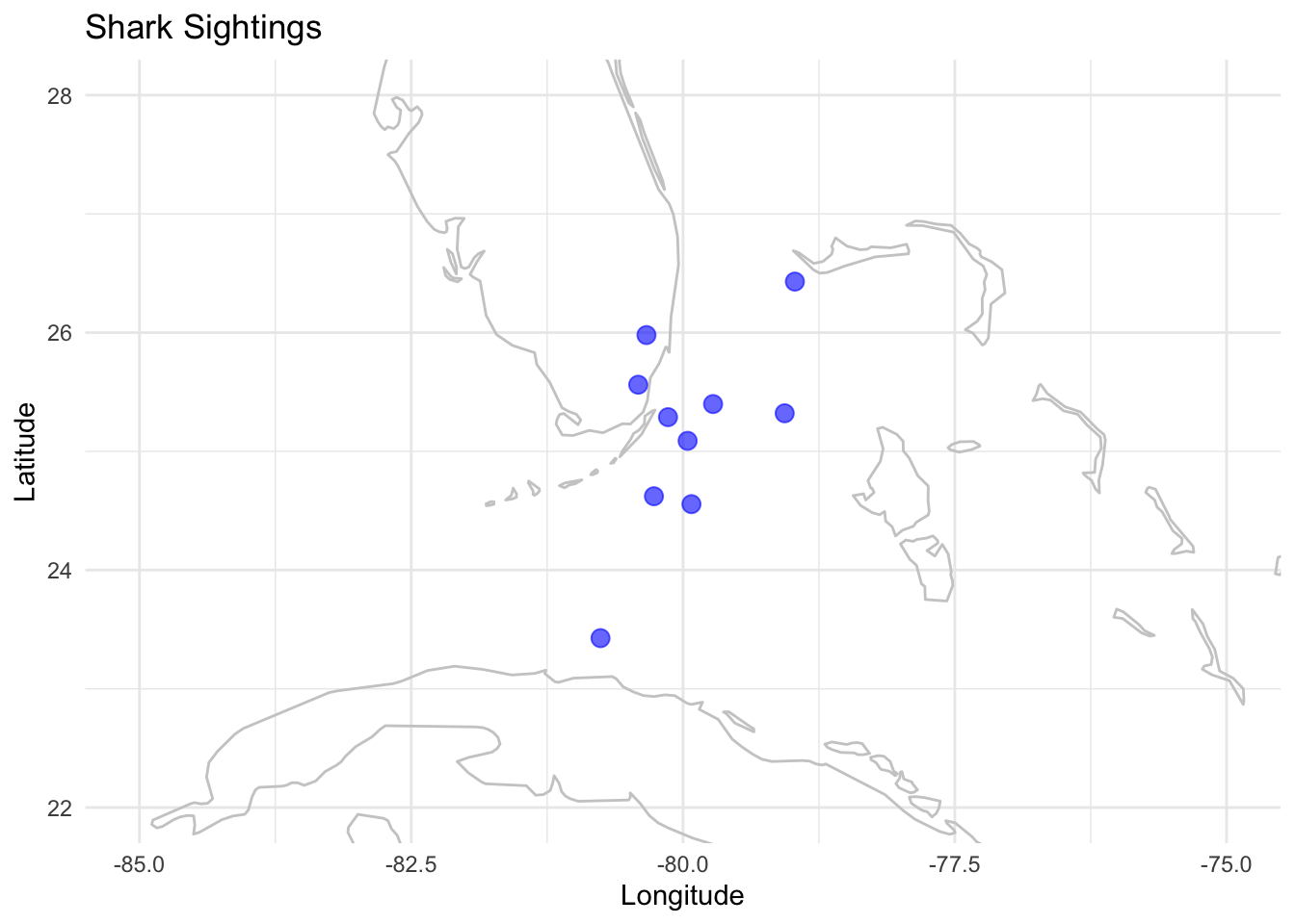
L. Ridgeline Plots
Ridgeline Plots enable the visualization of the distribution of a numerical value across several groups.
Example: Visualizing sea surface temperatures across different years.
# Simulating data
set.seed(123)
data_ridge <- data.frame(year=factor(rep(2000:2004, each=100)), temp=rnorm(500, mean=25, sd=2))

# Ridgeline Plot using ggridges
library(ggridges)
p_ridge <- ggplot(data_ridge, aes(x=temp, y=year, fill=year)) +
  geom_density_ridges() +
  labs(x="Sea Surface Temperature (°C)", y="Year") +
  theme_minimal() +
  scale_fill_viridis_d()
p_ridge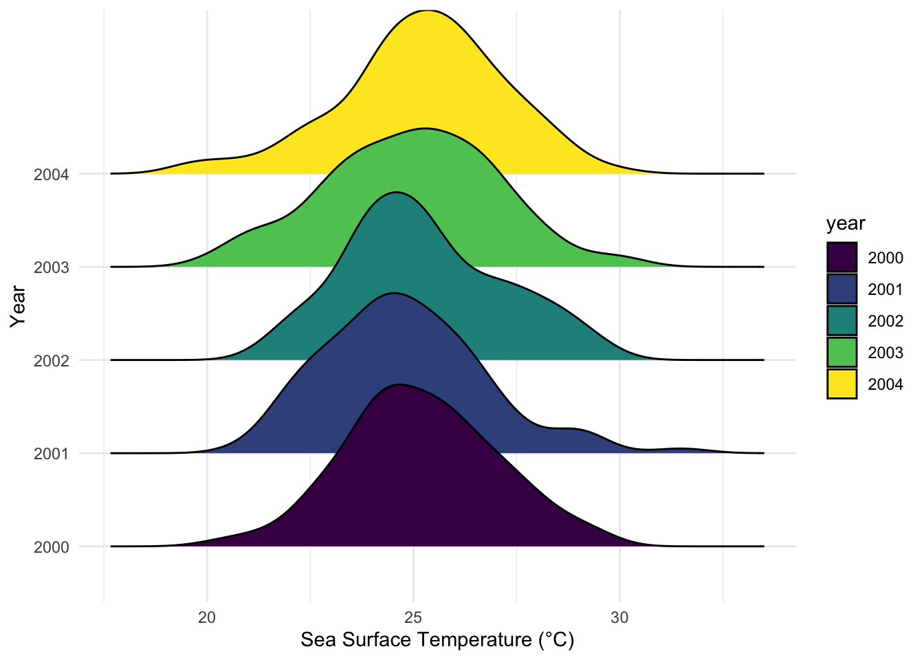
M. Correlograms/ or correlation matrix
Correlograms offer a visual representation of the correlation between different variables in a dataset.
Example: Exploring correlations between different oceanographic variables.
# Simulating data
set.seed(123)
data_corr <- data.frame(temp=rnorm(100, mean=25, sd=2), salinity=rnorm(100, mean=35, sd=0.5),
                        chlorophyll=rnorm(100, mean=2, sd=0.5), oxygen=rnorm(100, mean=5, sd=1))

# Correlogram using corrplot
library(corrplot)
corr_matrix <- cor(data_corr)
p_corr <- corrplot(corr_matrix, method="circle", type="upper", tl.col="black")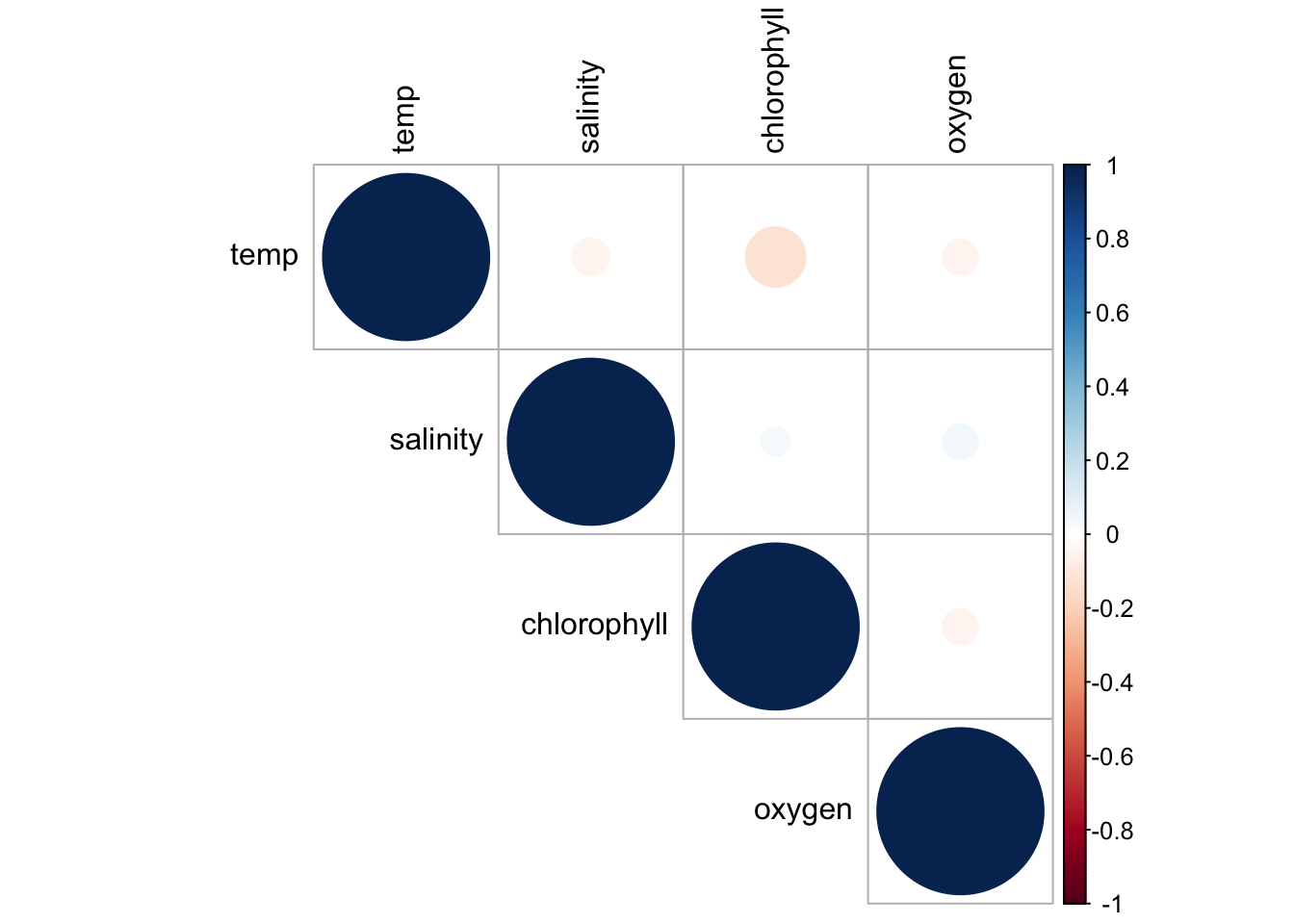
N. Bubble Plots
Bubble Plots represent three variables by utilizing the x, y position of points and a third variable represented by size.
Example: Representing biodiversity, sea surface temperature, and fishing intensity at different locations.
# Simulating dataset
set.seed(123)
data_bubble <- data.frame(lon=rnorm(20, mean=-80, sd=1), lat=rnorm(20, mean=25, sd=1),
                          biodiversity=rnorm(20, mean=100, sd=15))

# Bubble Plot using ggplot
p_bubble <- ggplot(data_bubble, aes(x=lon, y=lat, size=biodiversity)) +
  geom_point(alpha=0.6, color="blue") +
  labs(x="Longitude", y="Latitude", size="Biodiversity Index") +
  coord_fixed(ratio=1.3) +
  theme_minimal()
p_bubble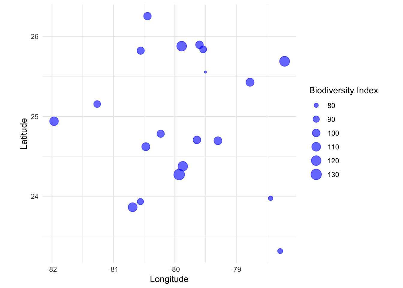
O. Stacked Area Plots
Stacked Area Plots illustrate the values of different groups on top of each other, showcasing the evolution of the total value as well as the part each group represents.
Example: Observing the catch of different fish species over time.
# Simulating data
set.seed(123)
data_area <- data.frame(year=rep(2000:2010, each=3),
                        species=rep(c("Sardine", "Tuna", "Salmon"), times=11),
                        catch=rnorm(33, mean=1000, sd=200))

# Stacked Area Plot using ggplot
p_area <- ggplot(data_area, aes(x=year, y=catch, fill=species)) +
  geom_area(position="stack") +
  labs(x="Year", y="Catch (tons)", fill="Species") +
  theme_minimal()
p_area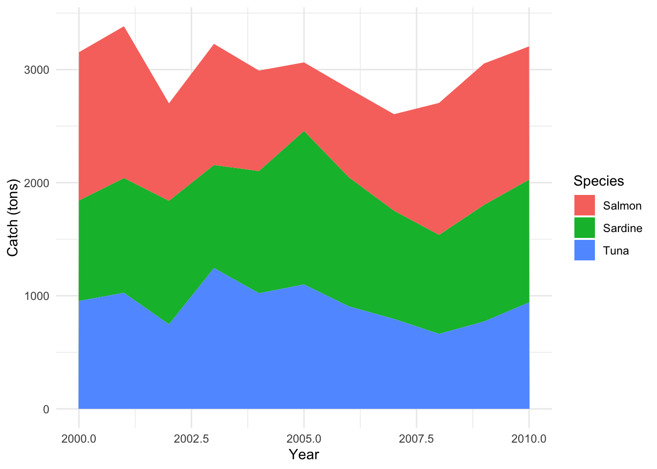
P. Patchwork: Combining ggplot2 Plots
The patchwork package allows for easy combination and layout manipulation of ggplot2 plots, offering an elegant and readable syntax. It’s like “patchworking” your plots together!
Installation:
You can install patchwork from CRAN:
The main idea behind patchwork is that you can add plots together using +, /, and other operators to specify different layouts.
Examples:
Combine Two Plots Side-by-Side:
p_area + p_bubble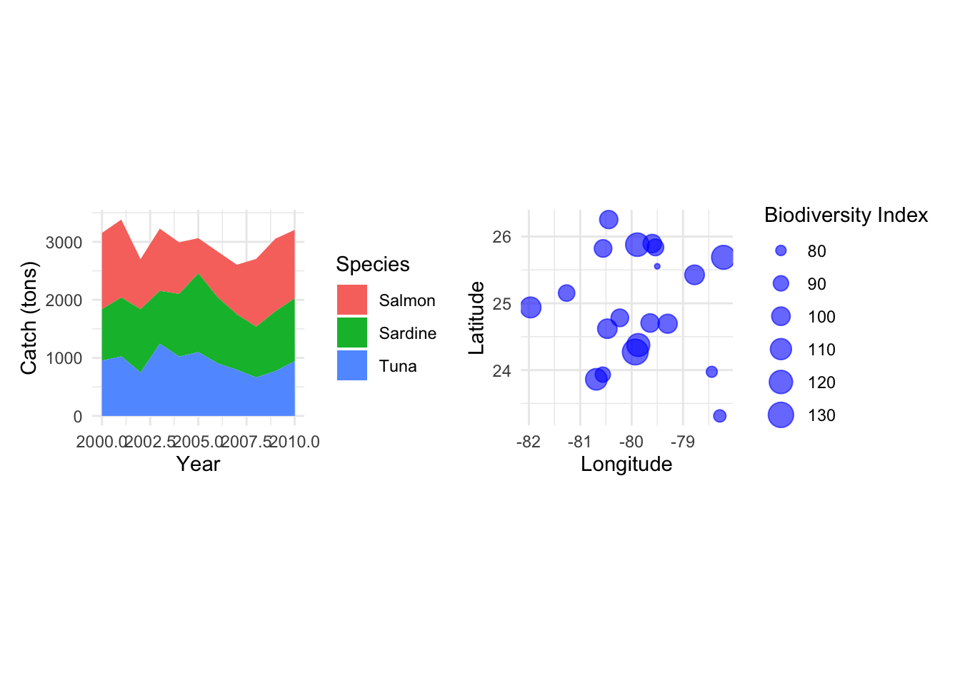
Arrange Vertically:
p_map / p_area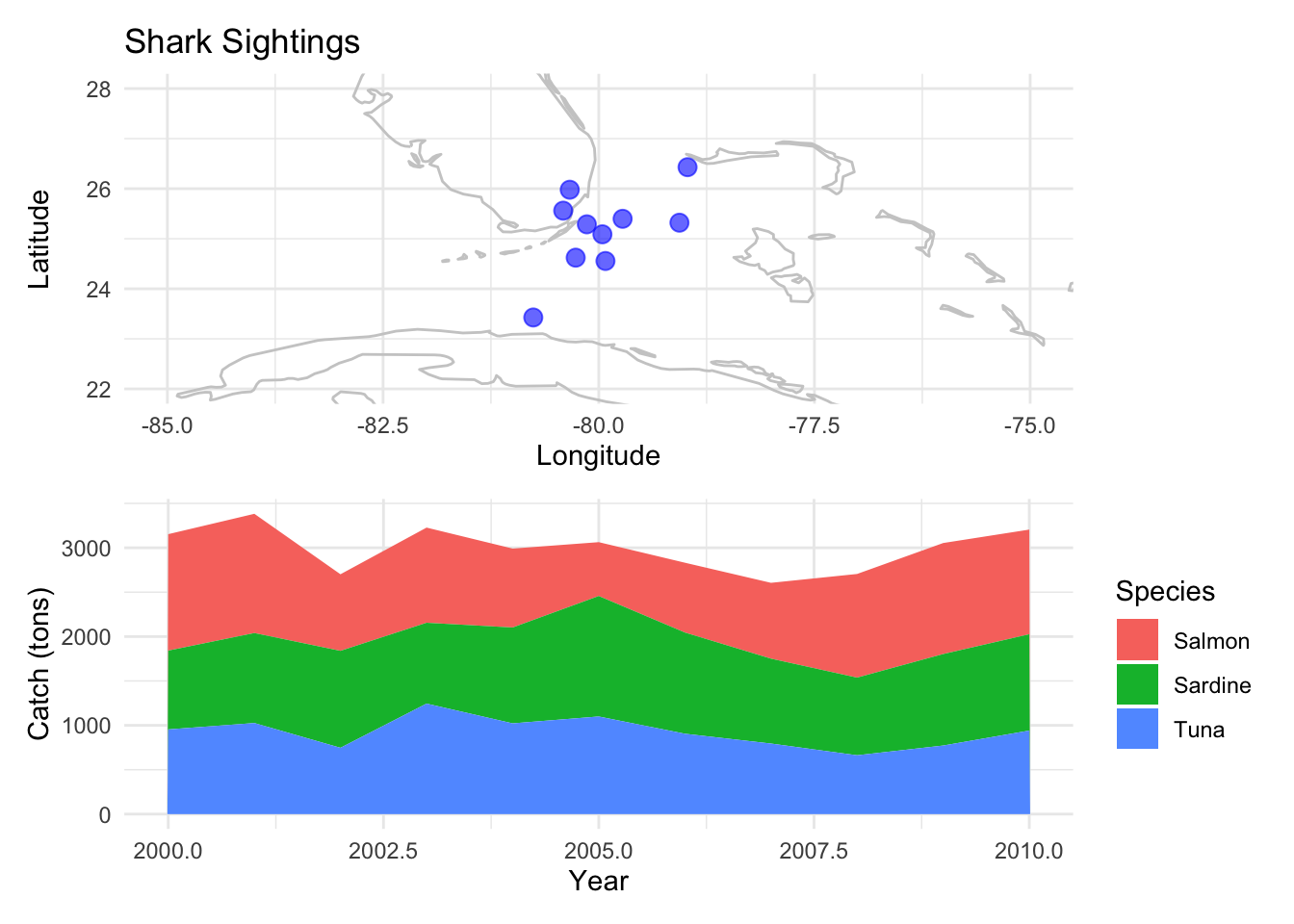
Nested Layouts: If you want a more complex layout, you can nest combined plots:
(p_pie + p_heatmap) / p_facet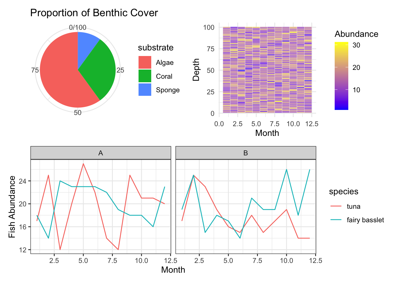
You can label your plots using plot_annotation:
(p_bubble + p_map) + plot_annotation(tag_levels = 'A')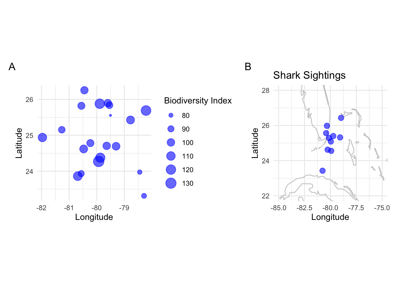
Adding an empty area
p_map + plot_spacer() + p_bubble + plot_spacer() + p + plot_spacer()
… and much more! for further reading: https://patchwork.data-imaginist.com/index.html