###########################
# Lab Activity Week 5: Palmer penguin linear regression
# Author: Lauren Olinger
# Date: September 18, 2023
###########################Activity: Palmer Penguins Anatomy

Data were collected and made available by Dr. Kristen Gorman and the Palmer Station, Antarctica LTER, a member of the Long Term Ecological Research Network.
Objective:
To understand and perform linear regression using R and visualize the relationship between two continuous variables in the Palmer Penguins dataset.
Dataset:
The Palmer Penguins dataset contains size measurements for three species of penguins from three islands in the Palmer Archipelago, Antarctica.
Variables:
species: penguin species (Adelie, Chinstrap, Gentoo)
island: island name (Biscoe, Dream, Torgersen)
bill_length_mm: bill length (mm)
bill_depth_mm: bill depth (mm)
flipper_length_mm: flipper length (mm)
body_mass_g: body mass (g)
Initial Setup
1. Open a new script and make a header: At the top of your R script, include a header with your name, the date, and a brief description of the analysis.
2. Setting the Working Directory: Set the working directory to where your dataset is located, and where you want to save your scripts and outputs. It is helpful to save these scripts all together so you can come back to them.
setwd("set/your/working/directory/here")3. Install and load libraries: Load the necessary packages (e.g., tidyverse) for the exercise.
Important
you will need to install the palmerpenguins library in order to view the data. You must un-comment and run the install.packages("palmerpenguins") below. Remove or re-comment the command after installing.
# Install and load the necessary libraries
# install.packages("palmerpenguins")

library(palmerpenguins)
library(tidyverse)
Load, describe, and clean the dataset
4. Load the dataset and look at it
5. Describe the dataset
complete the sentence: “In this data, each row contains ________________”.
6. Clean the data and prepare for analyses
do we need to remove any NAs?
remove using na.omit(). remember that we used this same command last week.
did this work?
looks better - there is nothing in the row/column indices of penguins when we ask which row and column of penguins contains NA. Good.
Exploratory Data Analysis (EDA) and Visualization
7. summarize the data
Lets do some summarizing of the data first, using our trusty tidyverse syntax
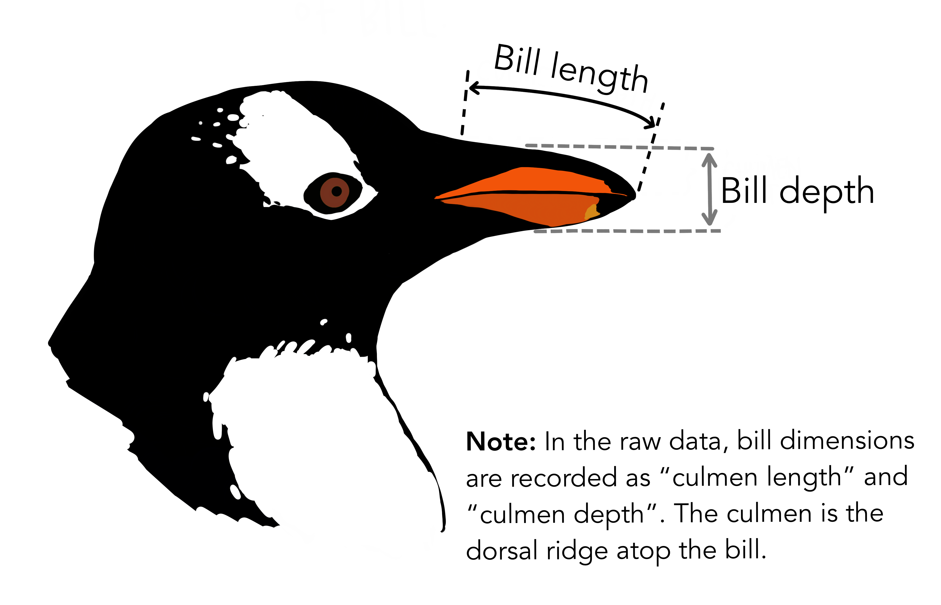
note the slightly different syntax and new use of across() to get means of all the numeric columns. This can be a useful tool just to get a feel for the data.
we see some differences between species in all of these variables, including bill length and body mass. If you are not a bird expert (I am not a bird expert), here is a helpful diagram showing what bill length and bill depth actually measured:
8. make a scatterplot of the data
Before getting into regression, it’s useful to visualize the data. Here we are looking at the relationship between bill length and body mass, and we are coloring each point by penguin species. Plot this and look at it in your console.
p <- ggplot(penguins, aes(x=body_mass_g, y=bill_length_mm, color=species)) +
  geom_point() +
  labs(x="Body Mass (g)", y="Bill Length (mm)")

p
note that we also store this ggplot as p because we will add to it later.
Conduct regression
9. Perform Regression
model <- lm(bill_length_mm ~ body_mass_g, data=penguins)here we are using lm() to perform the linear regression. here is some more information about each argument:
lm(): This stands for “linear model.” It is a function in R used to fit linear models, which can be either simple (one predictor) or multiple (more than one predictor).bill_length_mm ~ body_mass_g: This is the formula for the linear regression. The~symbol can be read as “is modeled as” or “is predicted by”. So,bill_length_mmis the response (or dependent) variable that we’re trying to predict, andbody_mass_gis the predictor (or independent) variable we’re using for prediction.data=penguins: This specifies the dataset being used, which in this case is thepenguinsdataset.model <-: This is assigning the output of thelm()function (i.e., the linear model) to a new variable namedmodel.
10. Summarize regression model
now get a summary of model using the summary() function.
summary(model)11. Interpret outputs of regression model
Interpret the outputs of this linear regression, referring to the previous section to do so. Interpret the following:
Coefficients, their estimates, errors and statistics
Redidual standard error
R squared (multiple and adjusted)
F statistic and Pvalue.
12. Add regression line to plot
extract the coefficients (the slope and intercept of the line from model)
coefficients <- coef(model)
intercept <- coefficients[1]
slope <- coefficients[2]
now use these coefficients as a line to add to the scatter plot:
p + geom_abline(intercept=intercept, slope=slope, color="black") # Regression lineChecking Assumptions
13. Homoscedasticity (Constant Variance)
Does the variance of the residuals remains constant across different levels of the independent variable(s)? This can be checked visually using a residuals vs. fitted values plot.
14. Normality of Residuals
For valid hypothesis testing (like testing if coefficients are significant), the residuals should be approximately normally distributed. This can be visually inspected using a histogram or a Q-Q plot.
- Histogram: Outliers or skewness in the histogram can indicate potential violations.
hist(residuals_data, breaks=20, main="Histogram of Residuals", xlab="Residuals")- QQ plot: A Q-Q plot provides a graphical view of how the residuals compare to a normal distribution. If the residuals are normally distributed, the points on the Q-Q plot should lie roughly on a 45-degree straight line.
15. Big picture questions
Based on what you see in the plot in number 12, do you think this regression does a good job of fitting bill length and body mass?
So far we only have one variable in our regression model. Could adding another grouping variable lead to a better fit regression line? From the plot in number 12, do you see any variables that you think could be useful for this? Explain your answer in 1-2 sentences.
Were the assumptions of homoscedasticity and normality of residuals met for this analysis? Explain your answer in 1-2 sentences